NOA WELLNESS

NOA

down to earth

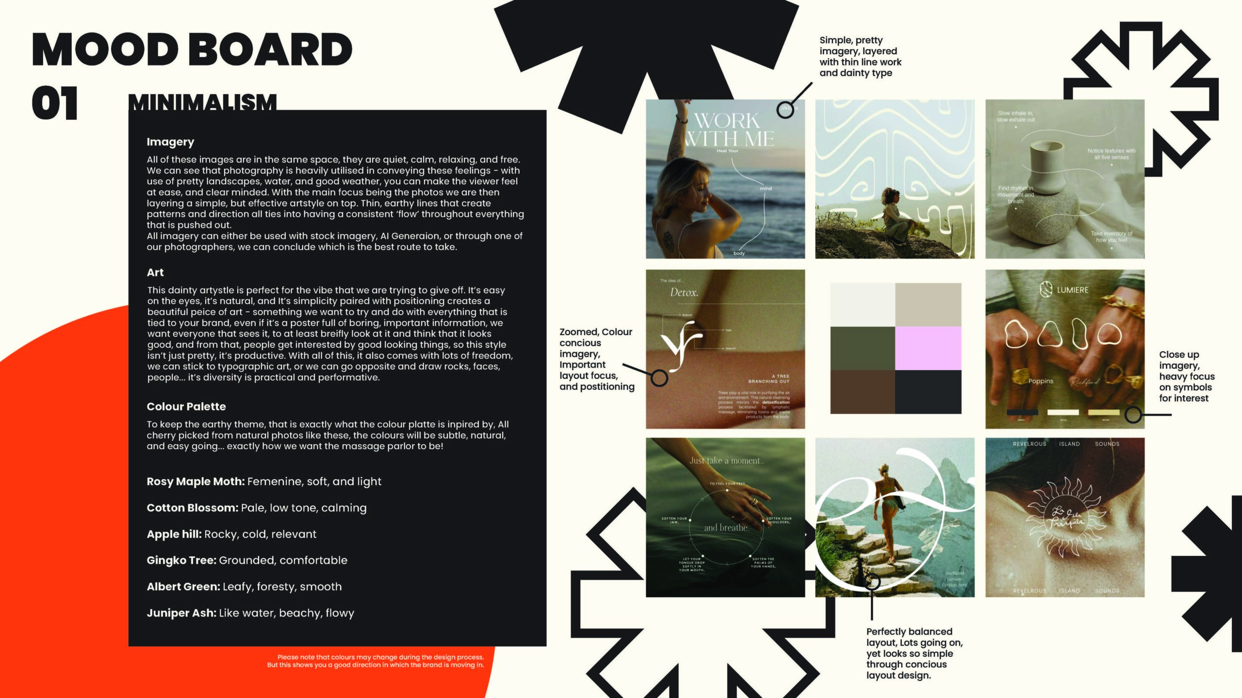
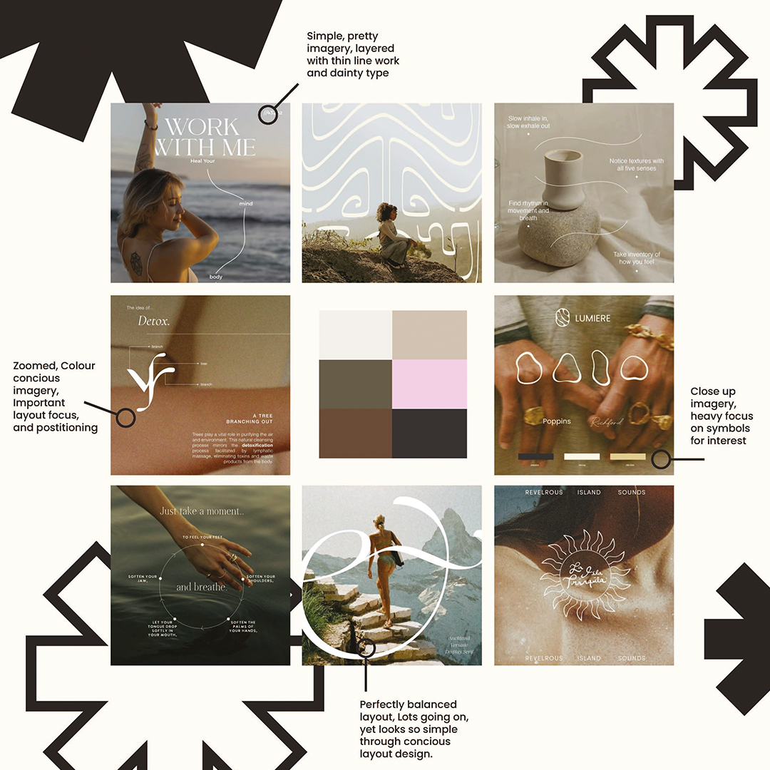
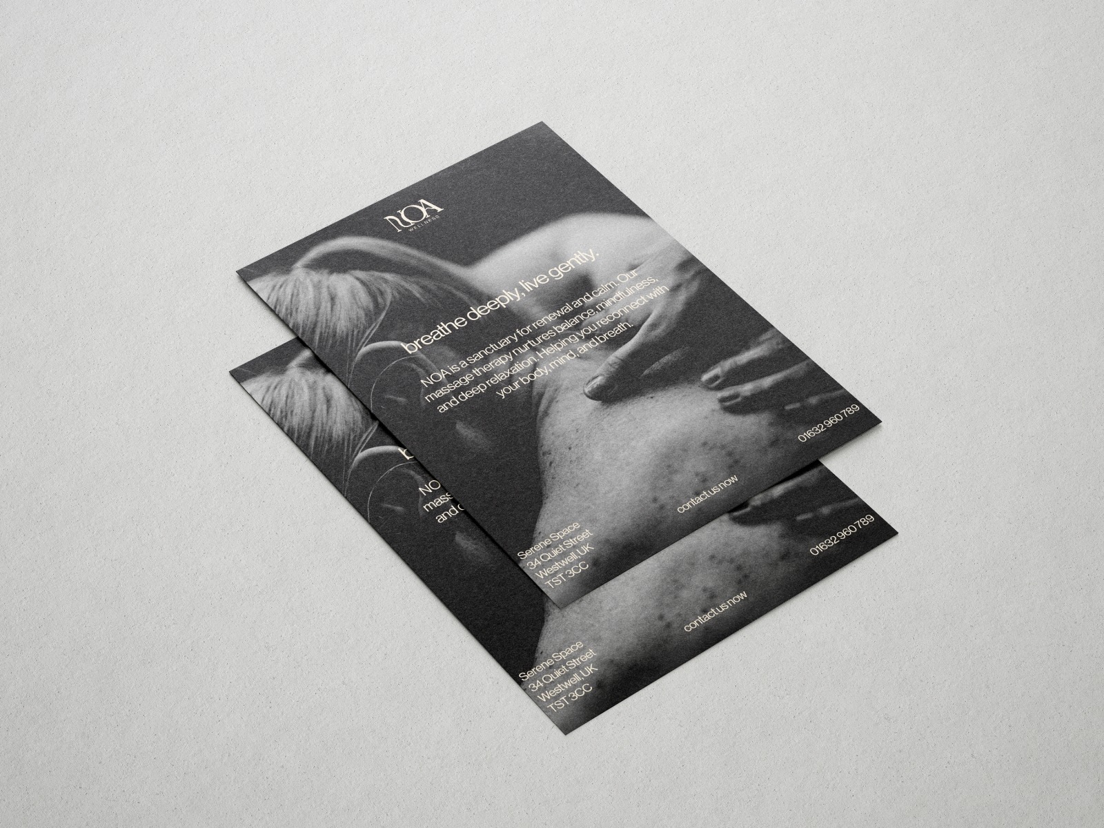
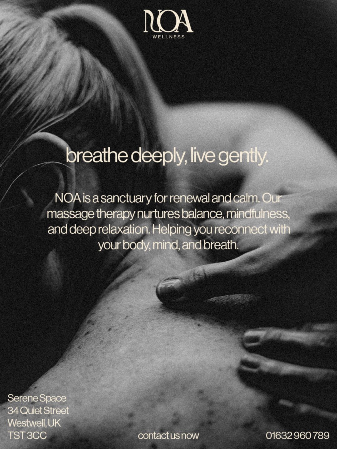
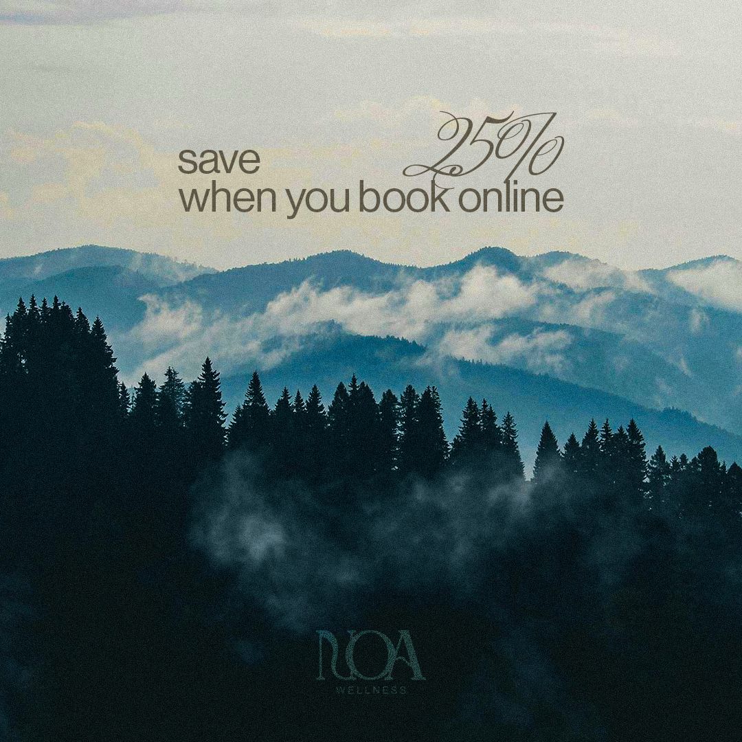
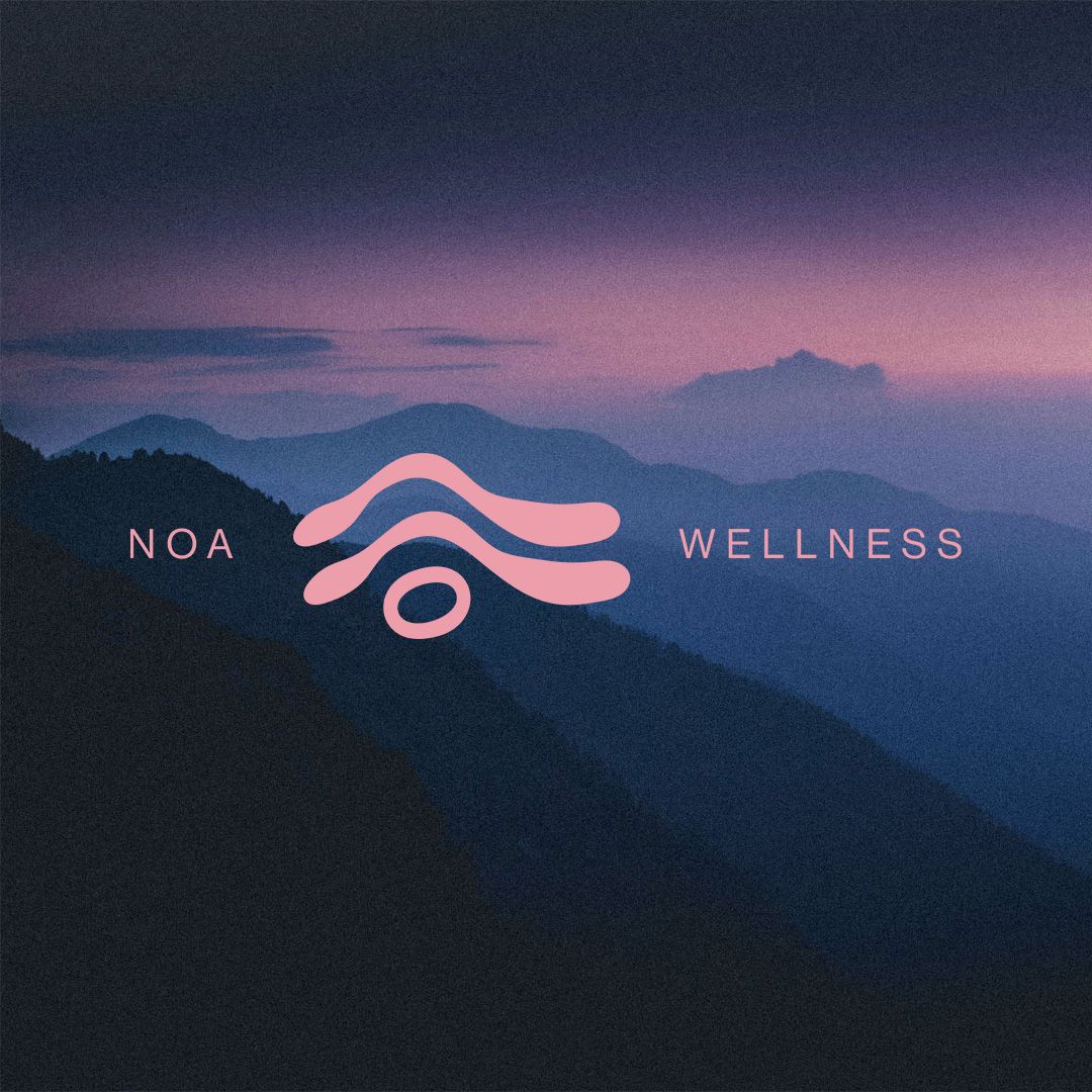
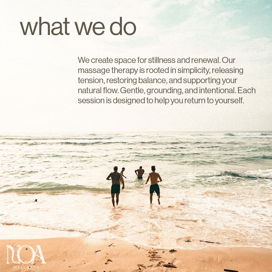
Lindsay came to us with a massage studio, a great talent in therapy… but no official business! so that’s where we came into play. Her thing was clearly therapy and she felt incredibly lost when it came to turning this passion into a business, so we started from scratch.

wellness without the cliches

With a the ball being completely in our court, with total creative freedom we made sure that no matter what, this wasn’t going to look like another therapy studio nearby, with cliche graphics, and super earthy aesthetics with no soul, we are trying to convey the message of quality, trust, and tranquility, tied together with standout but familliar visuals.

We loved the idea of this grainy, mid-toned aesthetic filled with earthy elements and shapes, dainty lines, and pretty typography, turning anything related to the brand into a natural, soothing peice of material.

a symbol of nature

Therapy and wellness businesses are become so mundane and visually unappealing so quickly, all because of just lack of thinking slightly out of the box… they just go straight to a leaf, or a yoga pose, or a flame… all been done before, completely forgetting that your logo is what makes the brand, its your mark, your symbol of recognition, it’s the face of everything you do… and will be around everything you do, so make it bloody good, and get creative… ofc, this is exactly what we did.

the fine details

After bouncing back ideas and looking for something fit, we discovered the name “NOA” Which is hebre for “movement, motion”. It was short, it looked great, sounded great… and most importantly it was different, it was standout, with meaning.

We created the wordmark first, making sure that we found the right typeface for the brand, we then tweaked and stylised it, and that really help set the tone for the icon… very directly as you can see. Using the crossbar for the ‘A’ we used this as a wave, as what better represents flow and movement other than water? but we couldn’t stop there, as NOA was all about control, stability, and movement, so we needed something to bring the icon closer to the ground… something solid like a rock.

With that an icon was created, not only did it look great, but it conveyed a simple diagram of what NOA was about without using any words… what more could you want from an icon? Pretty and fitting at first glance, and then upon discovery its rooted in meaning, bosh.

the branding in action

What was just a studio and Lindsay, was now transformed into NOA, and with that it needed some assets, the first step was a flyer, the main source of advertising for our client.

Bringing in the grainy photography as we had planned, a close-up of a massage session, tied with a blunt pallette, and clean writing, this flyer stood out immediately from any other competitors… as they would be using loud colours, too many photos, catchphrases, stuffing too many things into one small frame, creating an overstimulating mess, and ours was the opposite. It catches your eye not from vibrance, but from difference, with the typography following a spaced out swedish grid, the flyer was clean, captivating, and informative.

We always suggest having an instagram account tagged to the business straight away, it’s quicker than a website, and is a great temporary subsitute for one! so to get that kickstarted we created 3 posts of NOA, one for information, offers, and visual balance… giving the instagram page a good base to start off of!

want something similar?

Click this button and fill out a contact form, we look forward to hearing from you.

Info@auxa.co.uk

+44 7464 266837

Copyright © 2026 Auxa Creative LTD. All rights reserved. Registered in England and Wales

Info@auxa.co.uk | +44 7464 266837

Copyright © 2023 Auxa Creative LTD. All rights reserved. Registered in England and Wales