GRAVITATE

GRAVITATE

Brand Development & Social Strategy

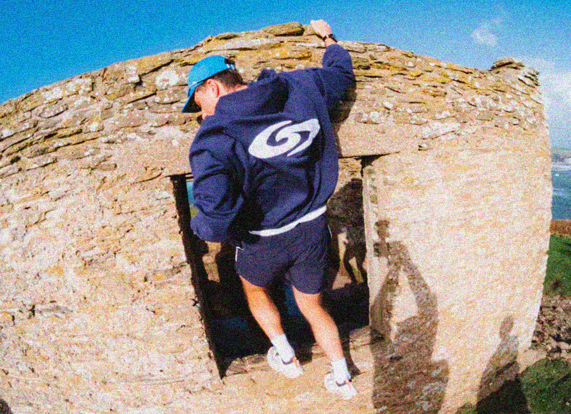
Gravitate Came to us with a problem that we see qutie often… they had a great product, great ideas, and an incredible mission, but the problem they where facing was how they looked.

now no i’m not talking about their hair, or the clothes they wore, I mean “Gravitate” didn’t really exsist visually. Sure there was products, photos, and a social media presence, but there was nothing clear showing what Gravitate looked like…

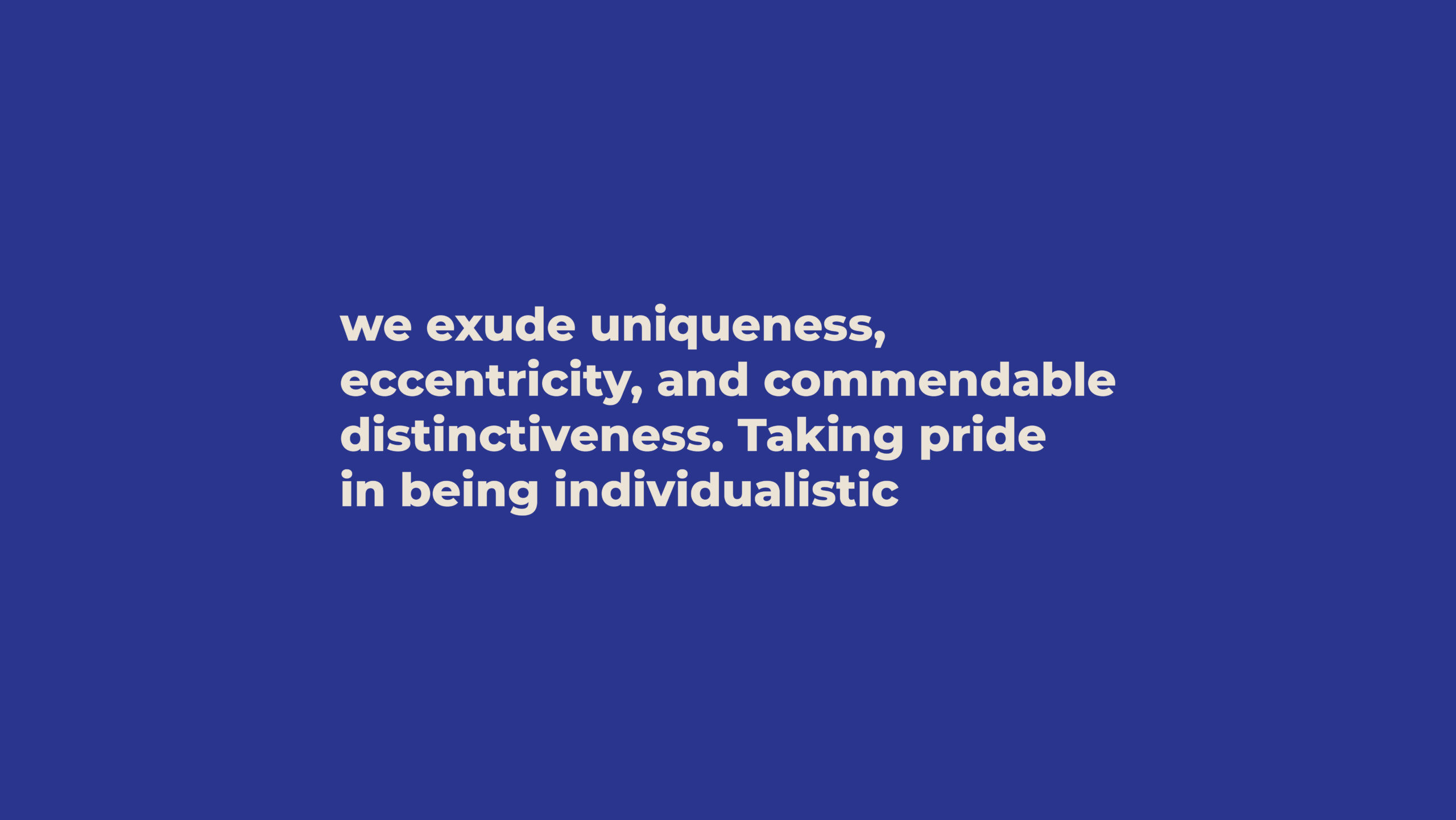
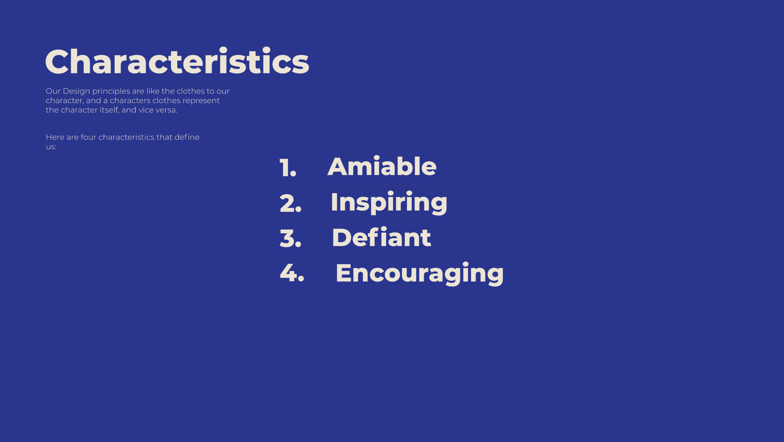
now this is a big issue! This is like having an incredible book, but it doesn’t have a front cover. Gravitate didn’t have a personality, it didn’t have brand colours, charactersitics, styles, nor emotions. and that’s where we stepped in…

brand guidelines

the foundation

Gravitate knew what they wanted; they just couldn’t put it into reality. Gravitate was something trapped and occupied in only their minds, and it was our job to bring it into reality, but why?

Gravitate had dreams and visons of being the coolest, best looking sport brand in the south west… and of all time – and if you want that, you have to really put effort into it’s appearance and how “gravitate” presented itself to the public. 


You have to ask yourself, what makes someone or something ‘Cool’? It’s the way someone talks, it’s how they have a bounce in their stride, it’s their hobbies. Now that usually happens as someone goes throughout life, they build this said personality to become this now ‘cool’ person, but when it comes to a brand, sure it may have history, but it’s not got a traditional friend group, nor life experiences to mould it’s personality and look… what it has, is us 😉

The bread and butter

So… with that in mind we are off to a tricky start, and to begin with we kicked this all of with alot of calls, moodboards, and back and fourths, so we could get a jist of what the client WANTED Gravitate to be. Because we can make something and someone out of nothing, but making something from basically scratch can go down quite a few avenues, and to save time for everything and everyone, it’s good to make sure we are on the right track first time around, so plenty of planning and bouncing ideas back and fourth is needed for this.

the base

So… with that in mind we are off to a tricky start, and to begin with we kicked this all of with alot of calls, moodboards, and back and fourths, so we could get a jist of what the client WANTED Gravitate to be. Because we can make something and someone out of nothing, but making something from basically scratch can go down quite a few avenues, and to save time for everything and everyone, it’s good to make sure we are on the right track first time around, so plenty of planning and bouncing ideas back and fourth is needed for this.

THE CORE

We now had the base of what Gravitate was going to be like, now the fun part… turning it into something visual, and turning the message into something that we can see! Gravitate’s main mission was to get people to… MOVE – so we needed to inspire people to move, through something we can see, and the best move for that, which aligned with gravitates character, was through illustrations, this paired with creative typography, was the hit!

THE OUTCOMES

Now this was just the tip of the iceberg from this 120 page document, if you’d like to see it in full don’t hesitate to ask. But let’s see how we put this into practice, with guidence and help of the gravitate team!

want something similar?

Click this button and fill out a contact form, we look forward to hearing from you.

Info@auxa.co.uk

+44 7464 266837

Copyright © 2026 Auxa Creative LTD. All rights reserved. Registered in England and Wales

Info@auxa.co.uk | +44 7464 266837

Copyright © 2023 Auxa Creative LTD. All rights reserved. Registered in England and Wales