Gravitate Came to us with a problem that we see qutie often… they had a great product, great ideas, and an incredible mission, but the problem they where facing was how they looked.
now no i’m not talking about their hair, or the clothes they wore, I mean “Gravitate” didn’t really exsist visually. Sure there was products, photos, and a social media presence, but there was nothing clear showing what Gravitate looked like…
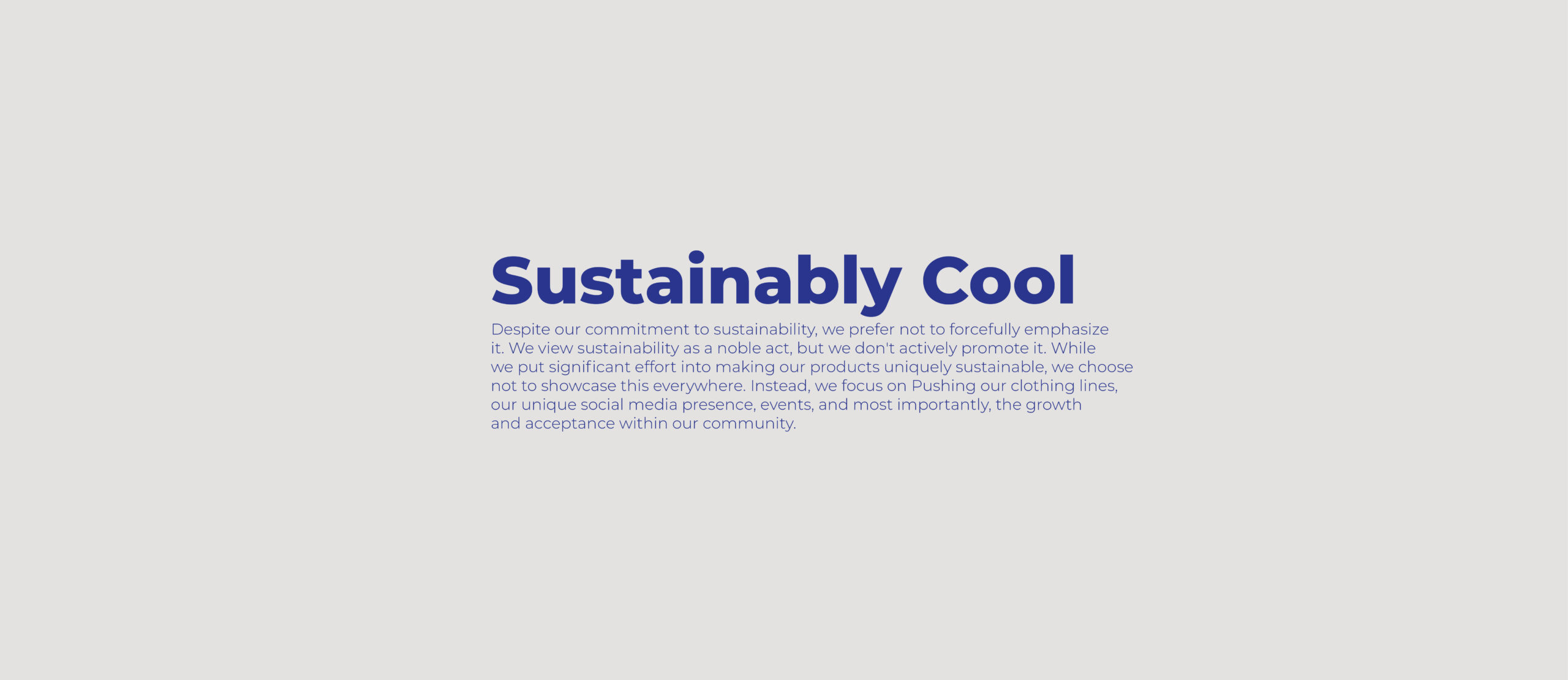
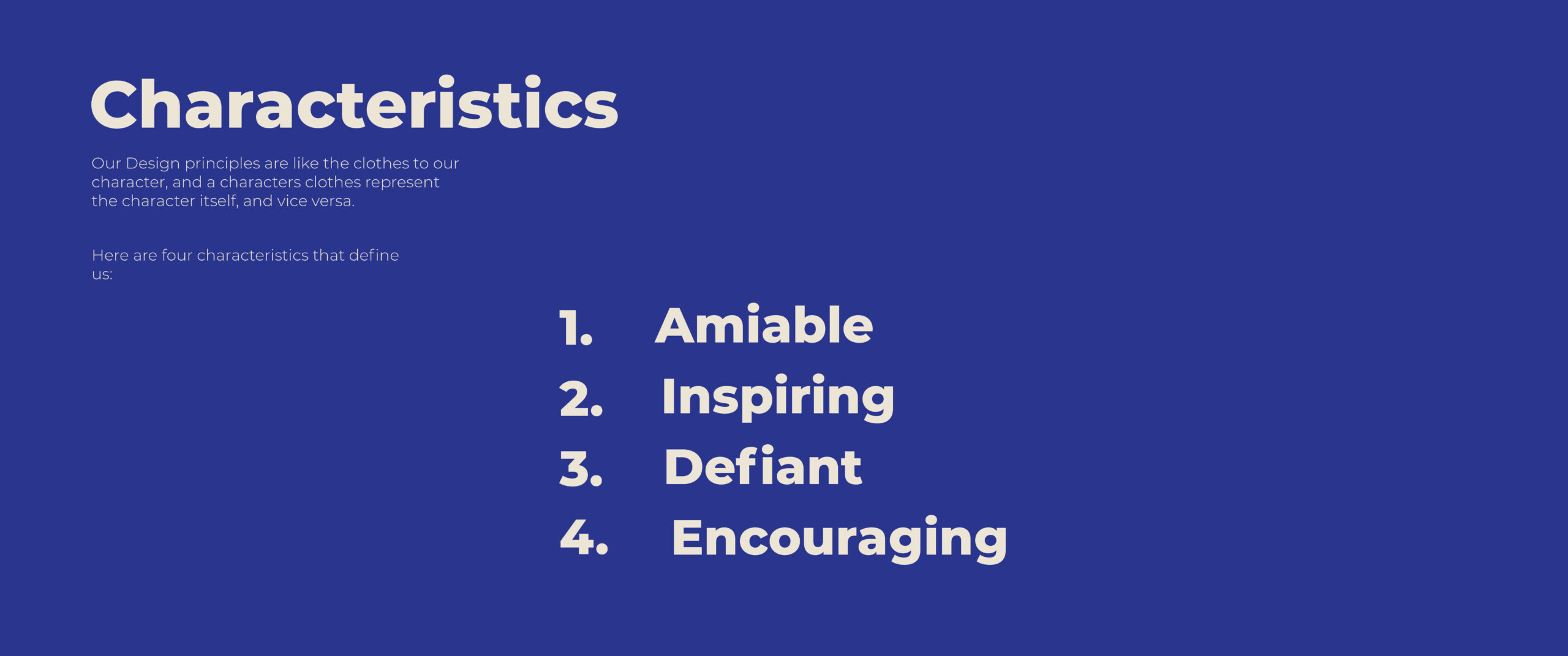
now this is a big issue! This is like having an incredible book, but it doesn’t have a front cover. Gravitate didn’t have a personality, it didn’t have brand colours, charactersitics, styles, nor emotions. and that’s where we stepped in…
For the brands stratergy, we needed Gravitate to rub off onto it’s customers, how will the customers be more like gravitate, and how can everyone spread the same message consistently.
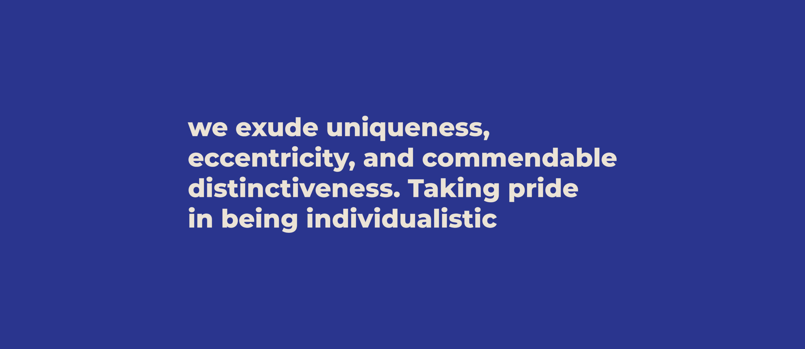
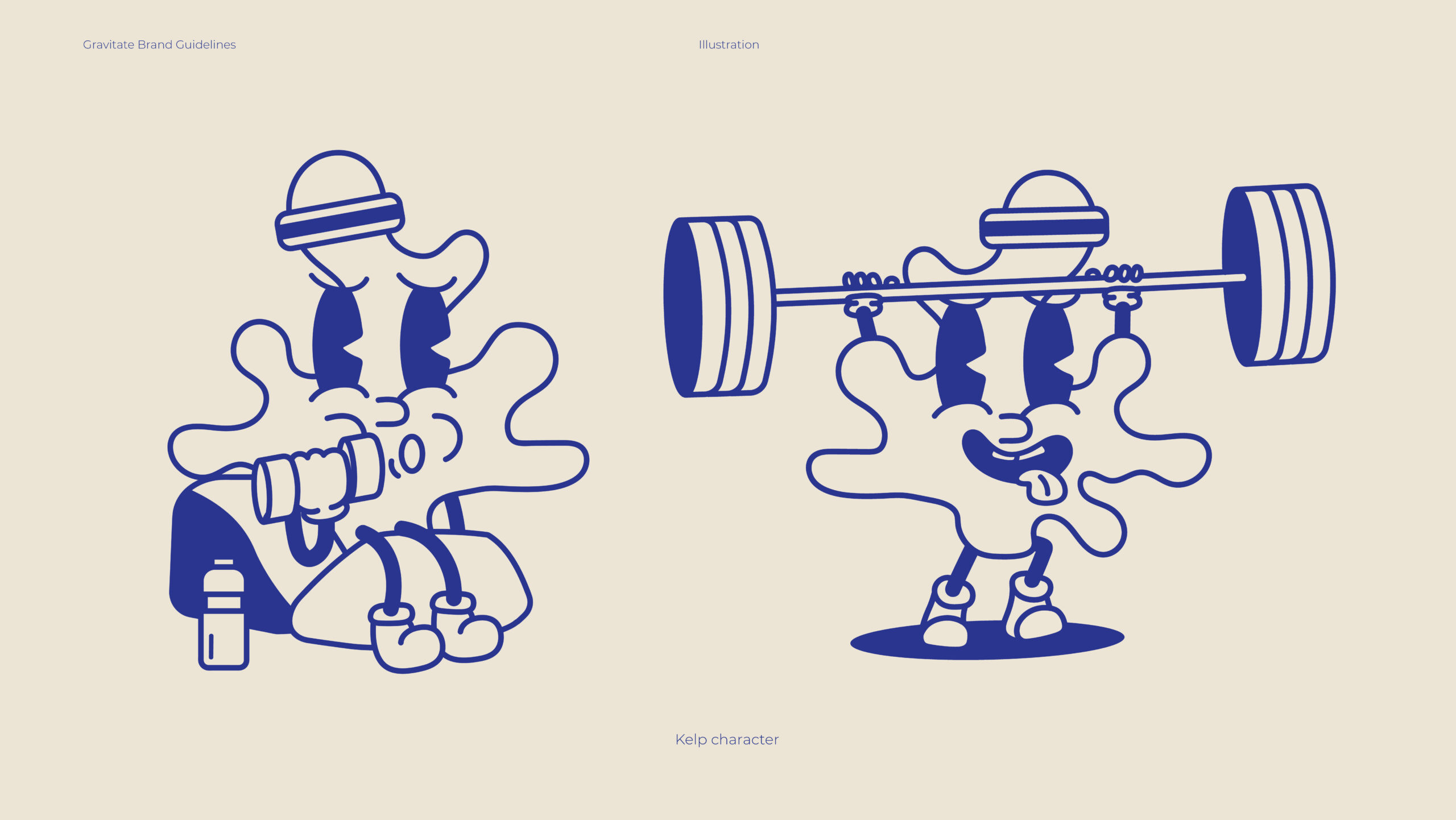
Creating the brands persona is key to a successful business. People find it hard to relate to things that aren’t human, so when you give something without personality, emotion, we can soon begin to feel like we know the brand like it’s a person. What does it act like, what would it look like if it was a person, how would Gravitate talk, walk, and act? how would it greet you in the street? is it an asshole? would you want to come across them in the street?
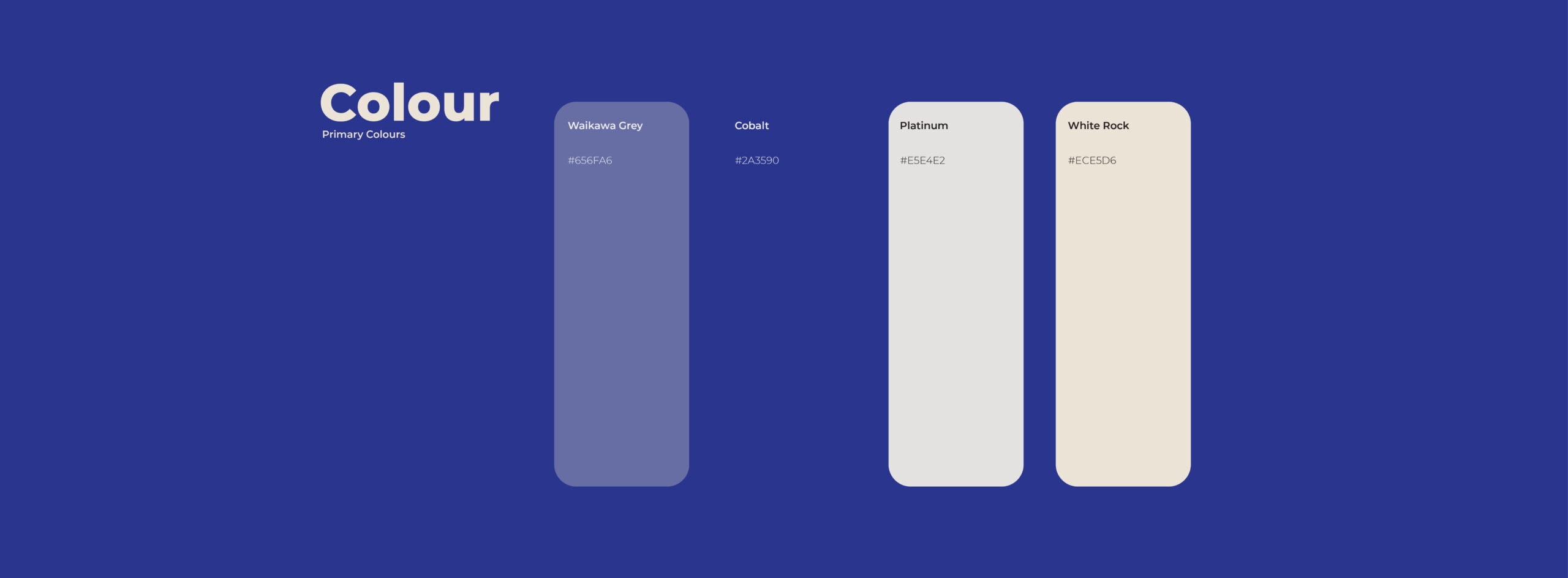
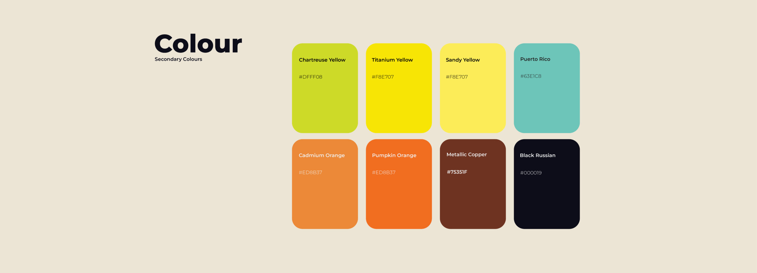
We humans love colour, and it is a compelling thing to utilise in your business. Not only will people recognise your business more easily due to your colours, but it also helps them feel something… that’s why we went with something lively, active, and feel-good for Gravitate.
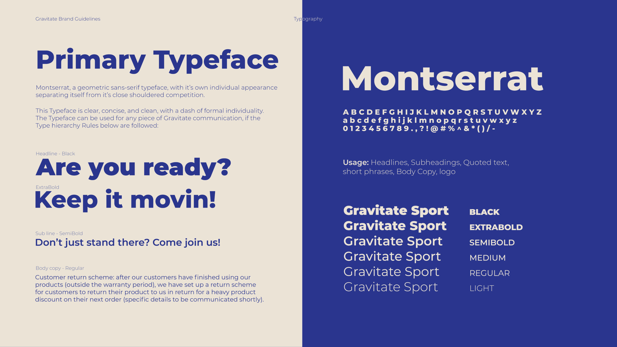
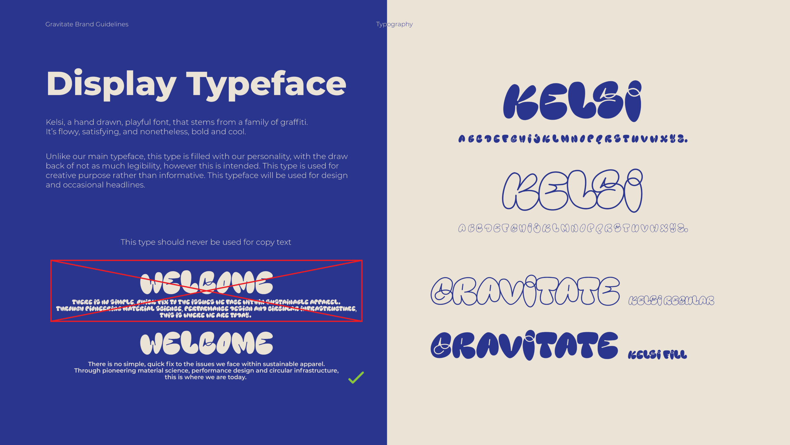
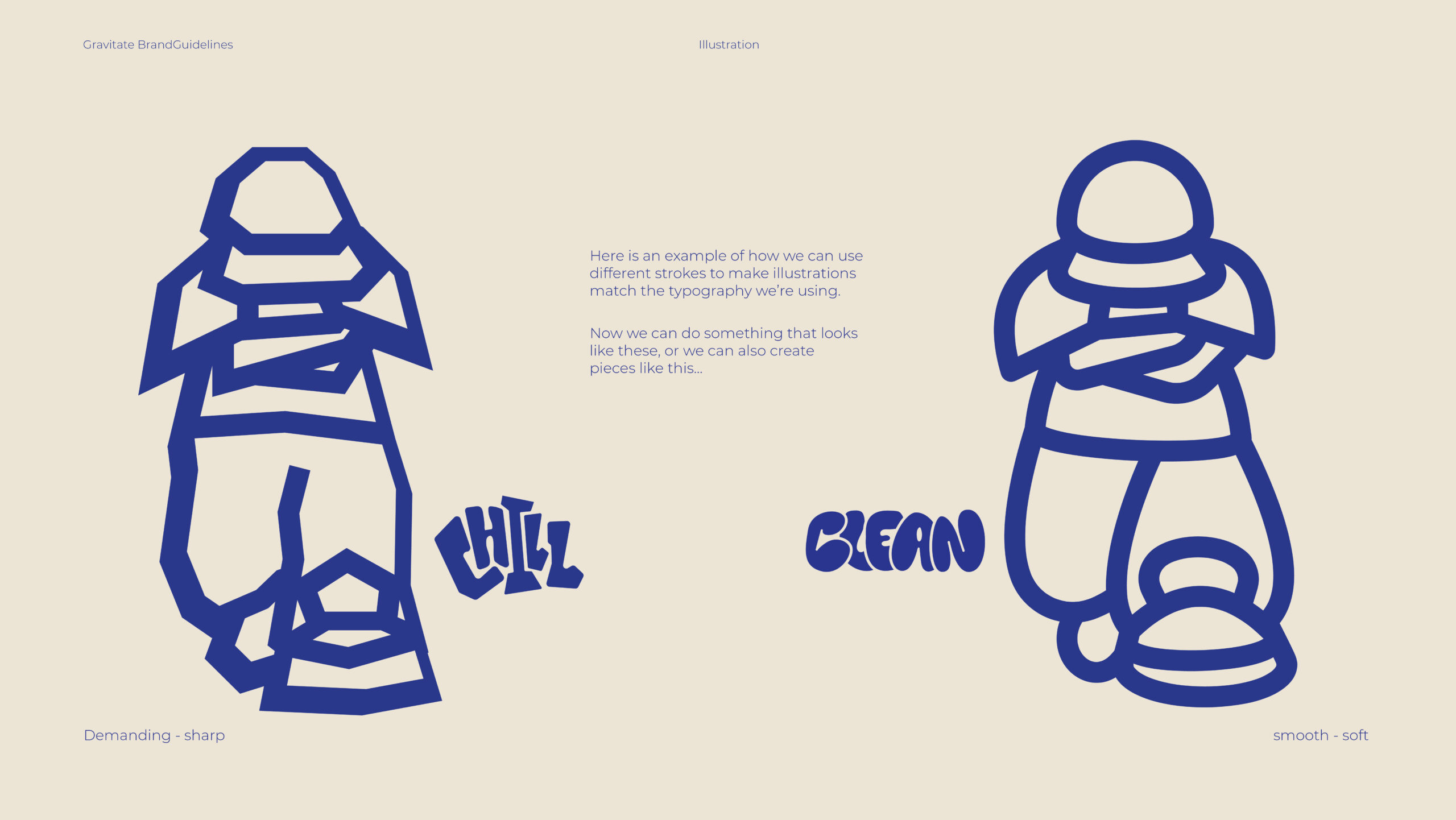
Typography is a lot more important than people may think. From branded business elements to reading things off a poster, we need to make sure how we write it looks fitting to our colours, and personality, else things will seem out of place and detached.
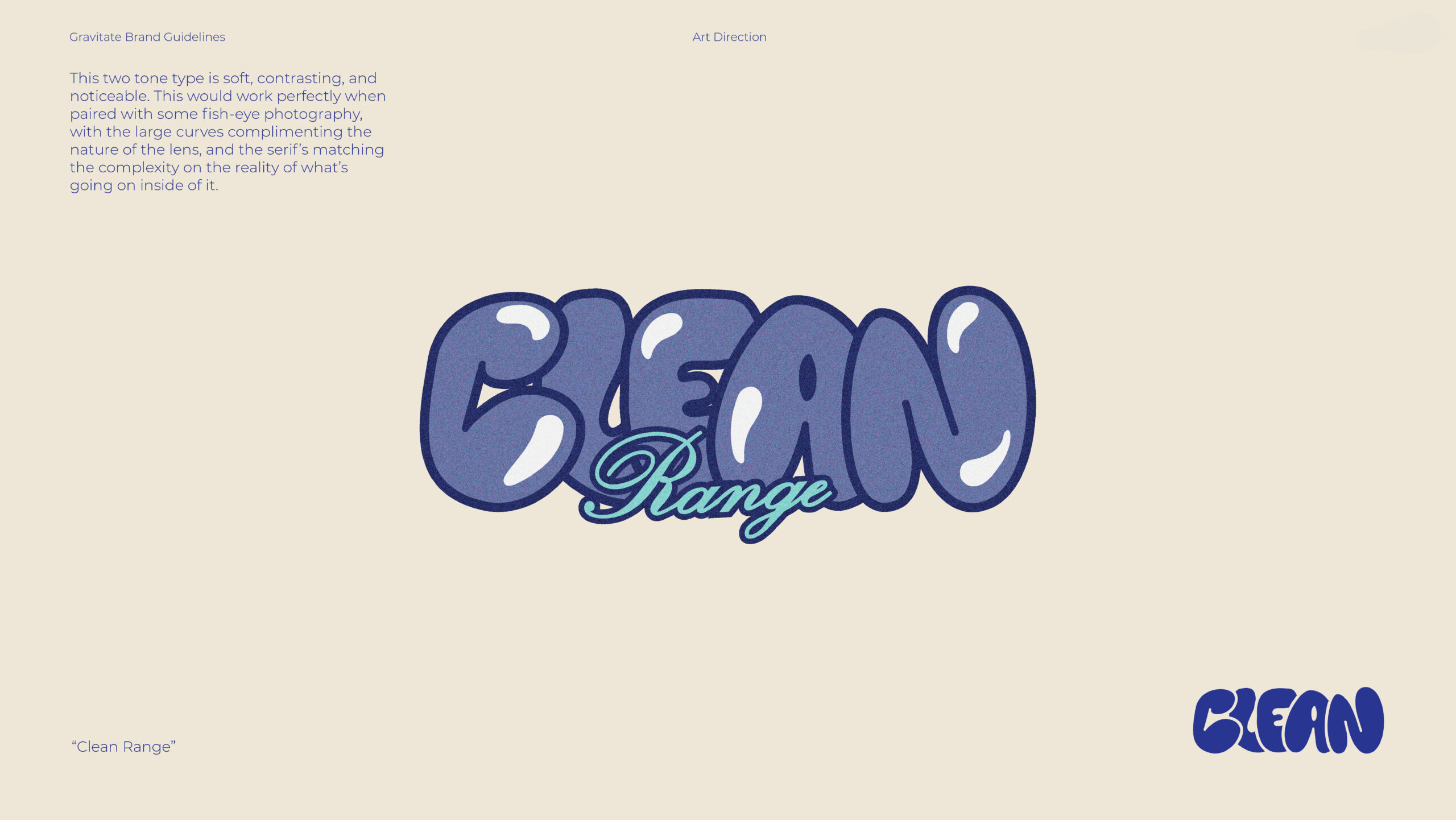
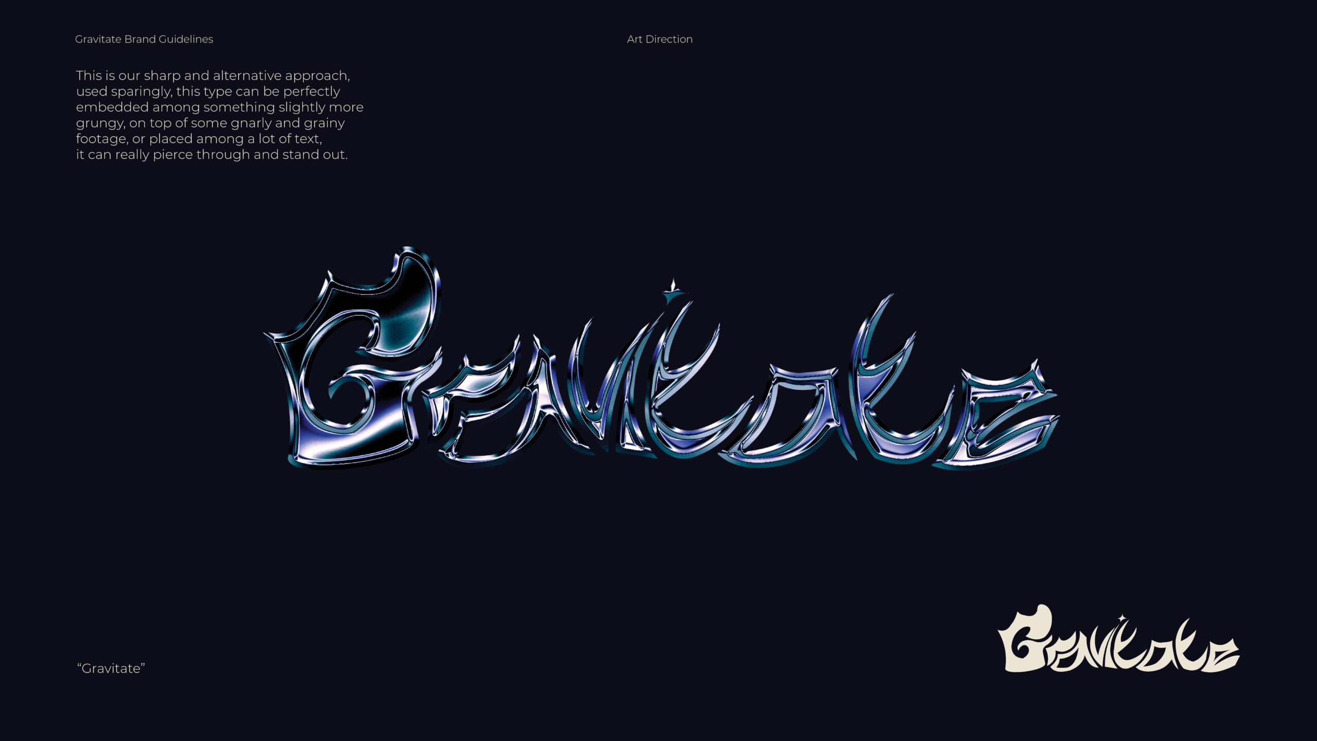
Now we can give out as many fonts as we want, but type is an incredibly versatile piece of your brand, that can be used anywhere and everywhere across your media. Using typography for complimenting art pieces, posts, and posters is a great way to create stunning products, so here we gave Gravitate some ideas on how they can implement this into something of there own.
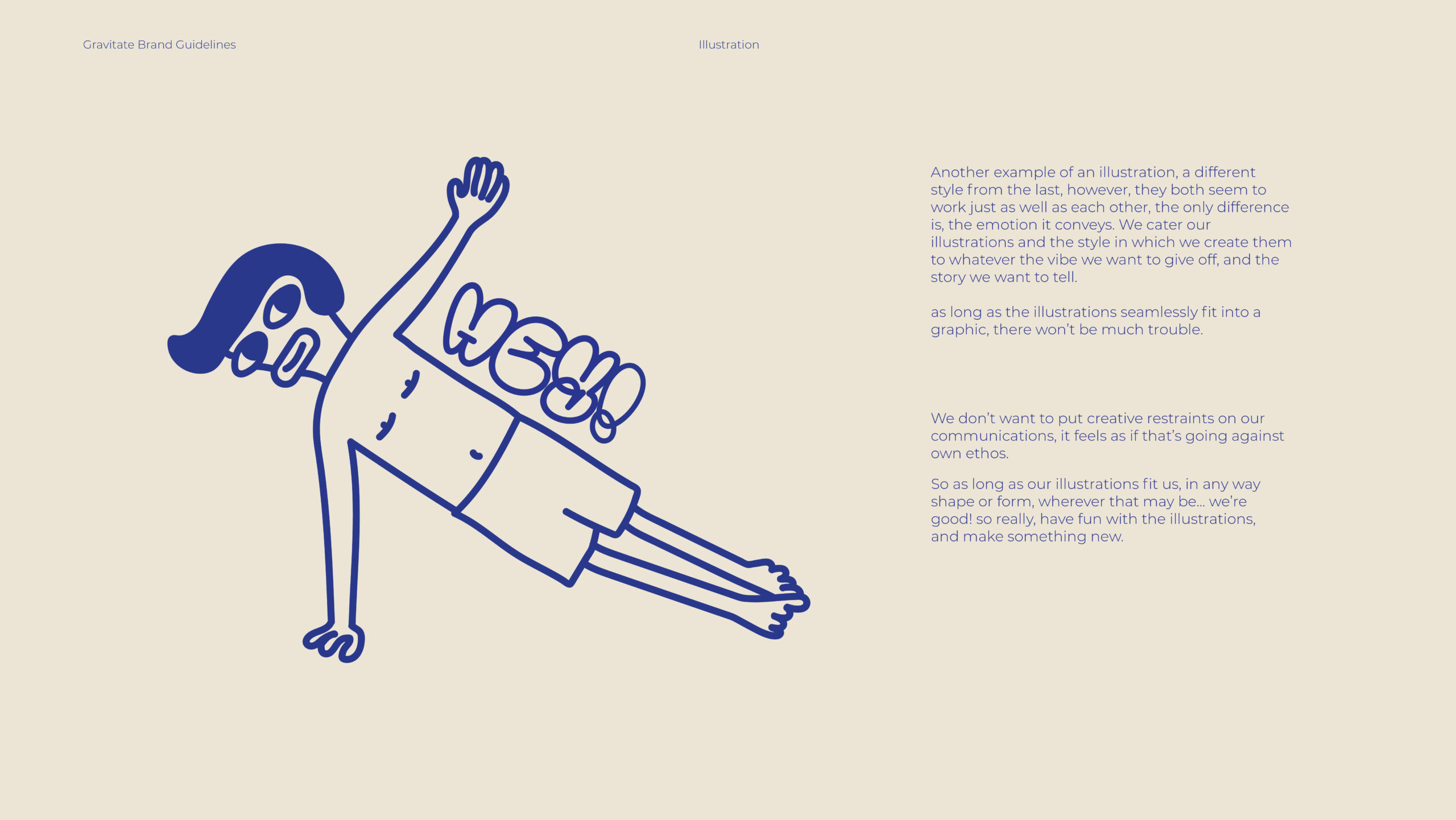
Would you look at that? seems like we’ve already got a pretty solid brand coming on, now it’s time to take it to the next level. Adding visual elements to brands is what can elevate them to their highest potential, it’s where you and us designers can give the brand its own sense of complete individuality.
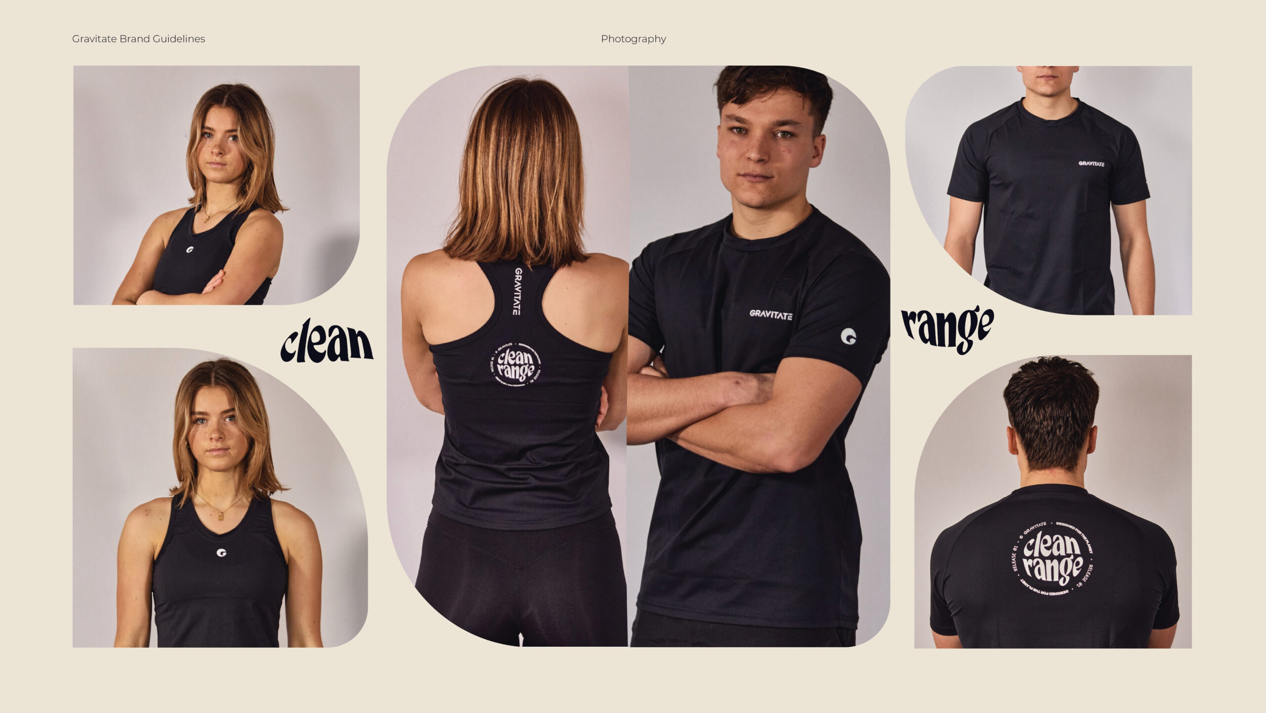
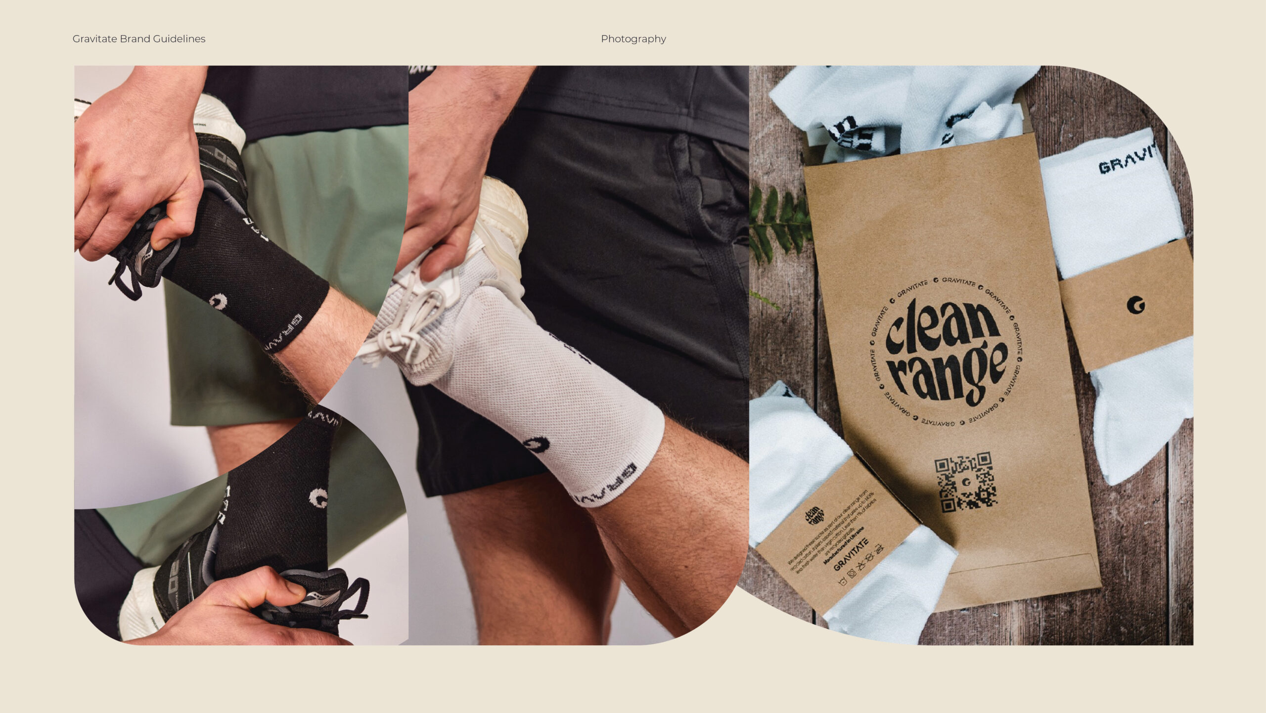
Photography for a sports brand is key, there needs to be life, energy, and passion within the photos you take to inspire your customers. You want people to see others doing great things in your apparel, things that they want to be doing, things that they dream of, after all, if you saw a 16-year-old benching 405lbs in a gravitate shirt, you can’t tell me there wouldn’t be a little bit inside of you telling you that you now want that shirt.
Working with Gravitate was a pleasure, Through thorough communication and great teamwork, we created a 76-page brand guideline document that has helped elevate their brand immediately, we have given them a verbal and visual set of tools that they can use across all of gravitates medias, allowing them to create their own content, in a consistent and stylish manner.