GRAVITATE

GRAVITATE

"social" drops

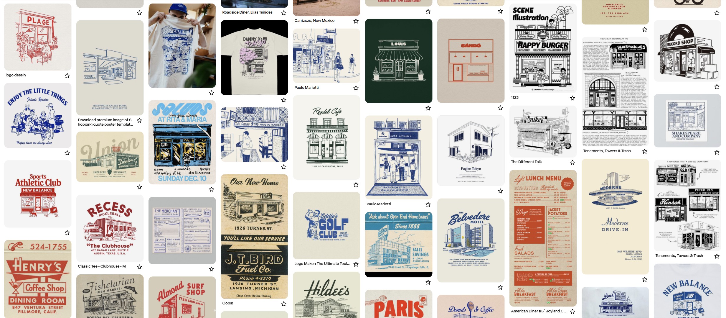
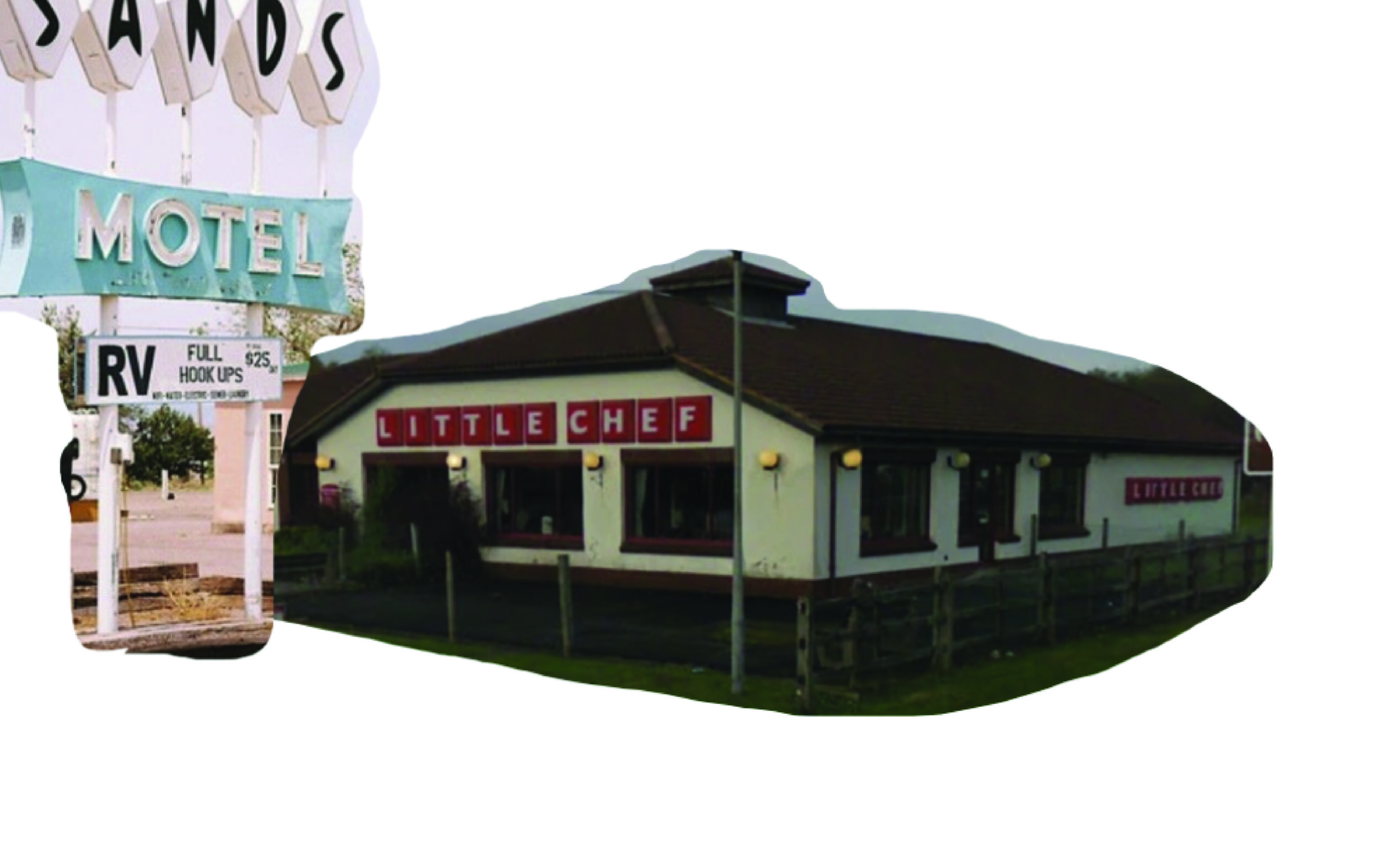
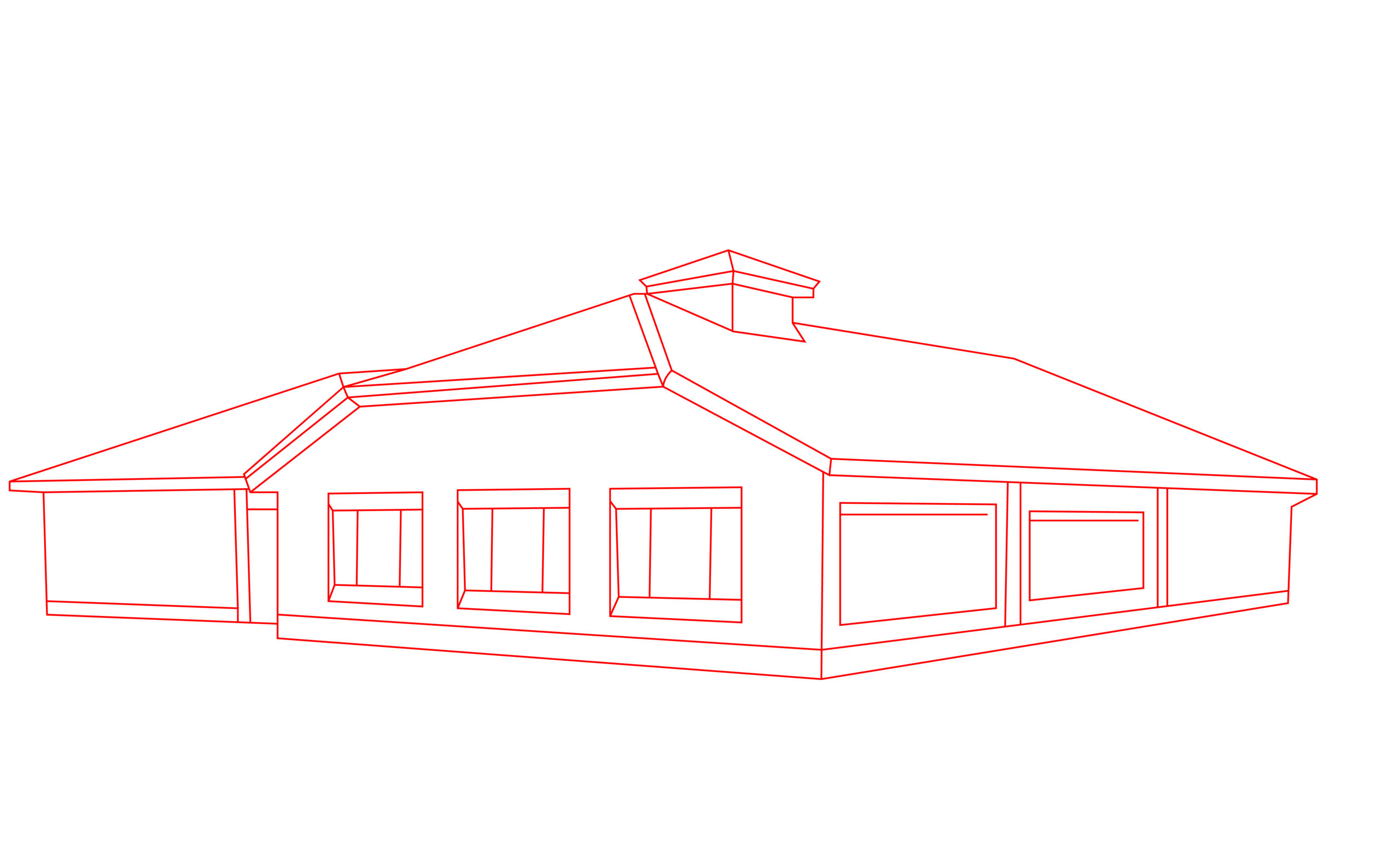
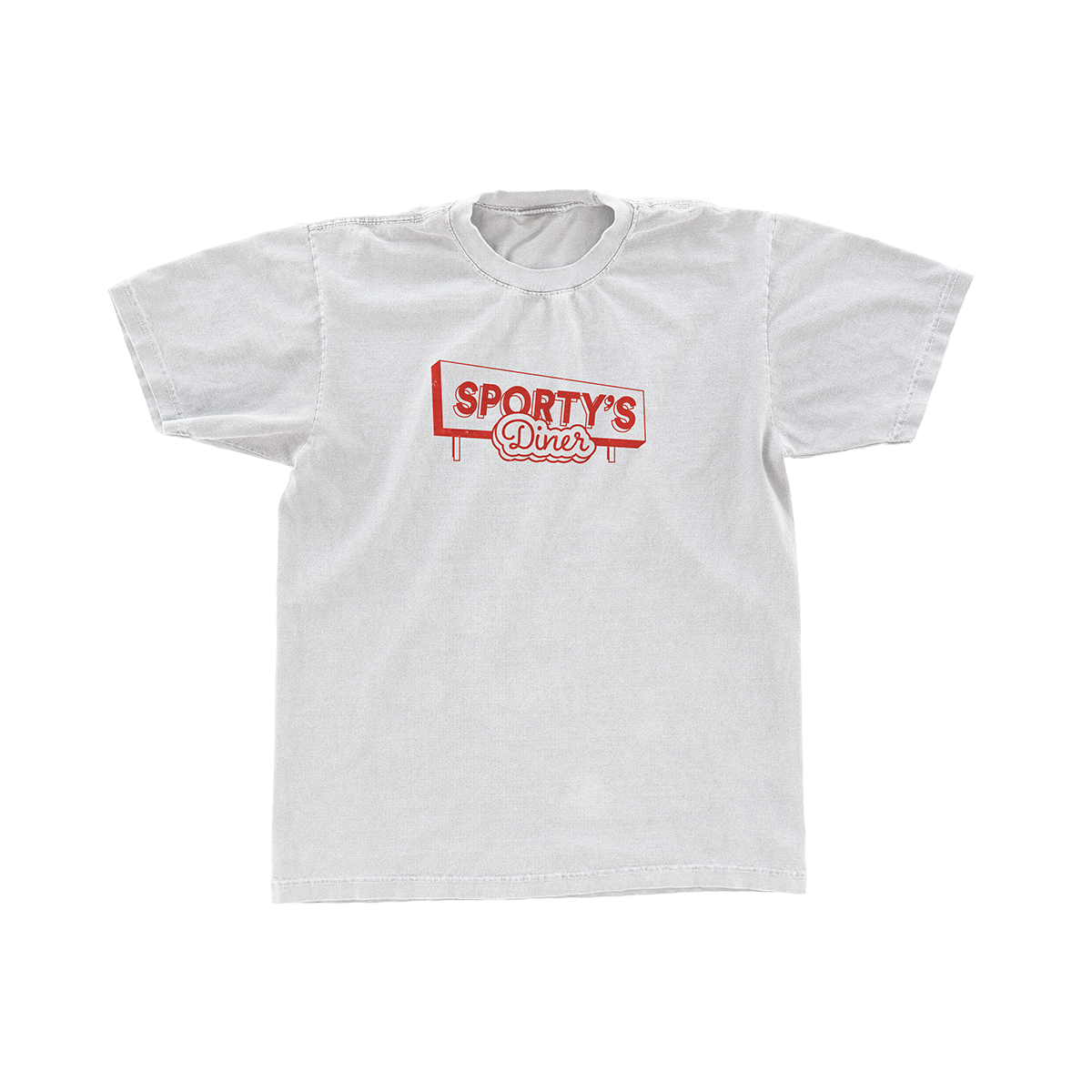
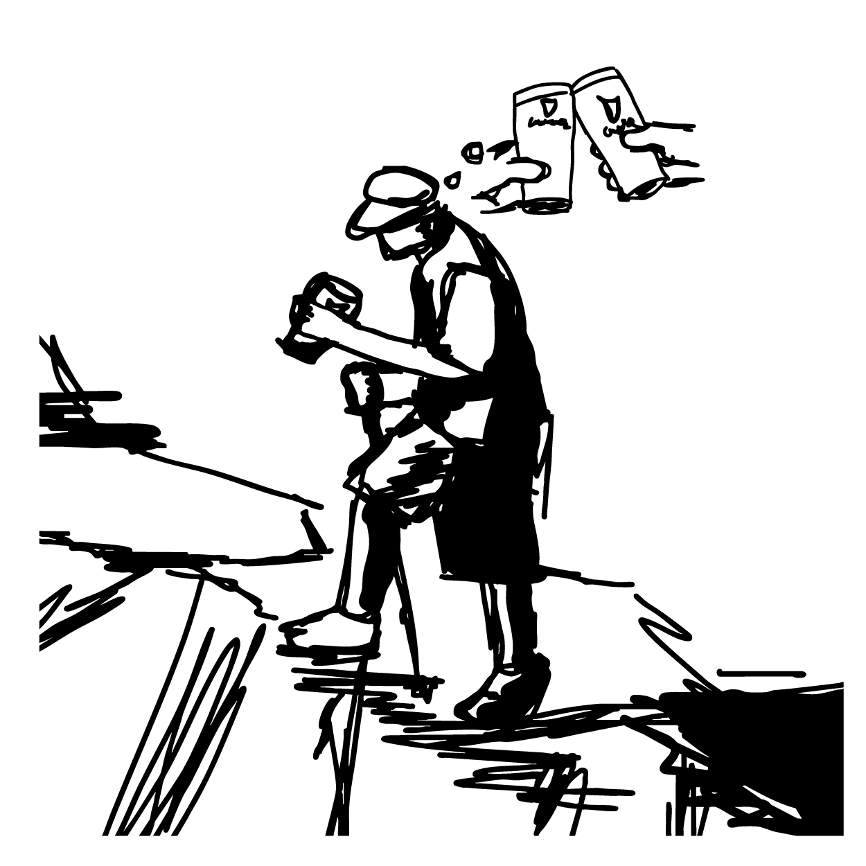
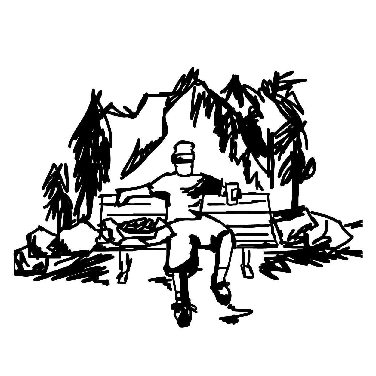
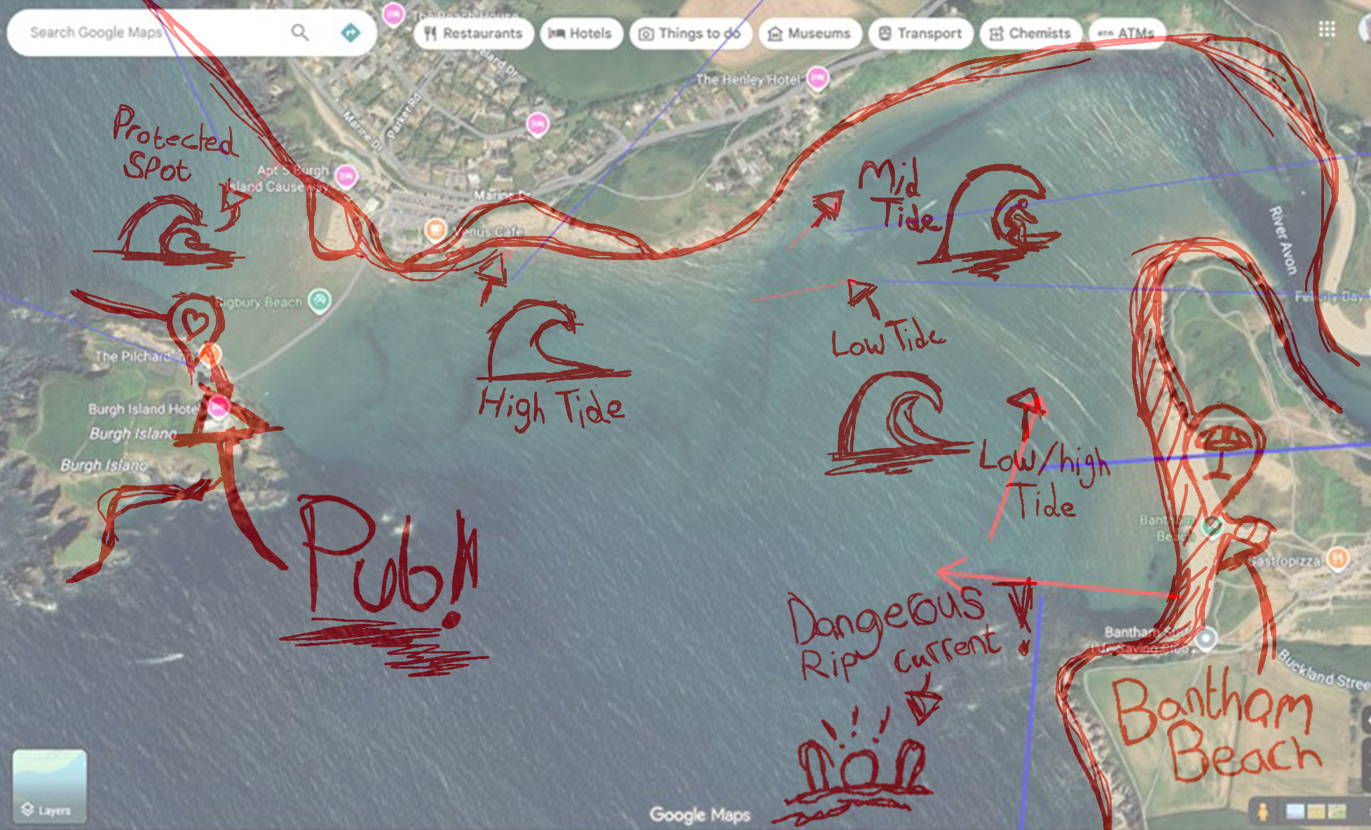
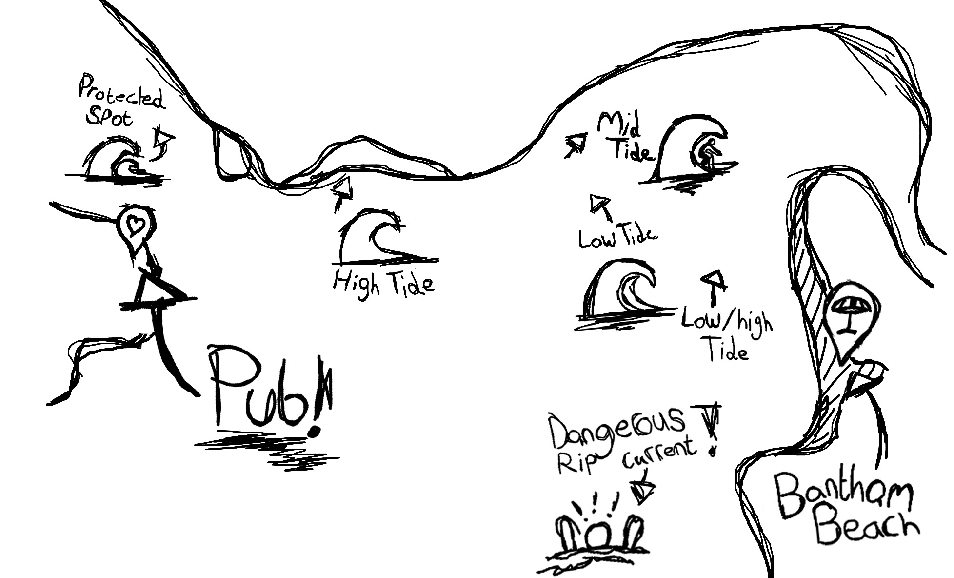
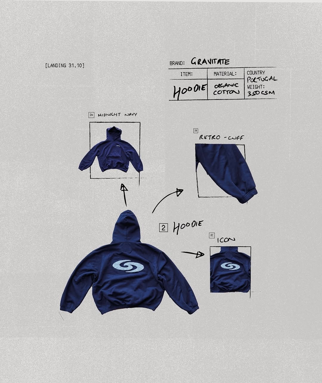
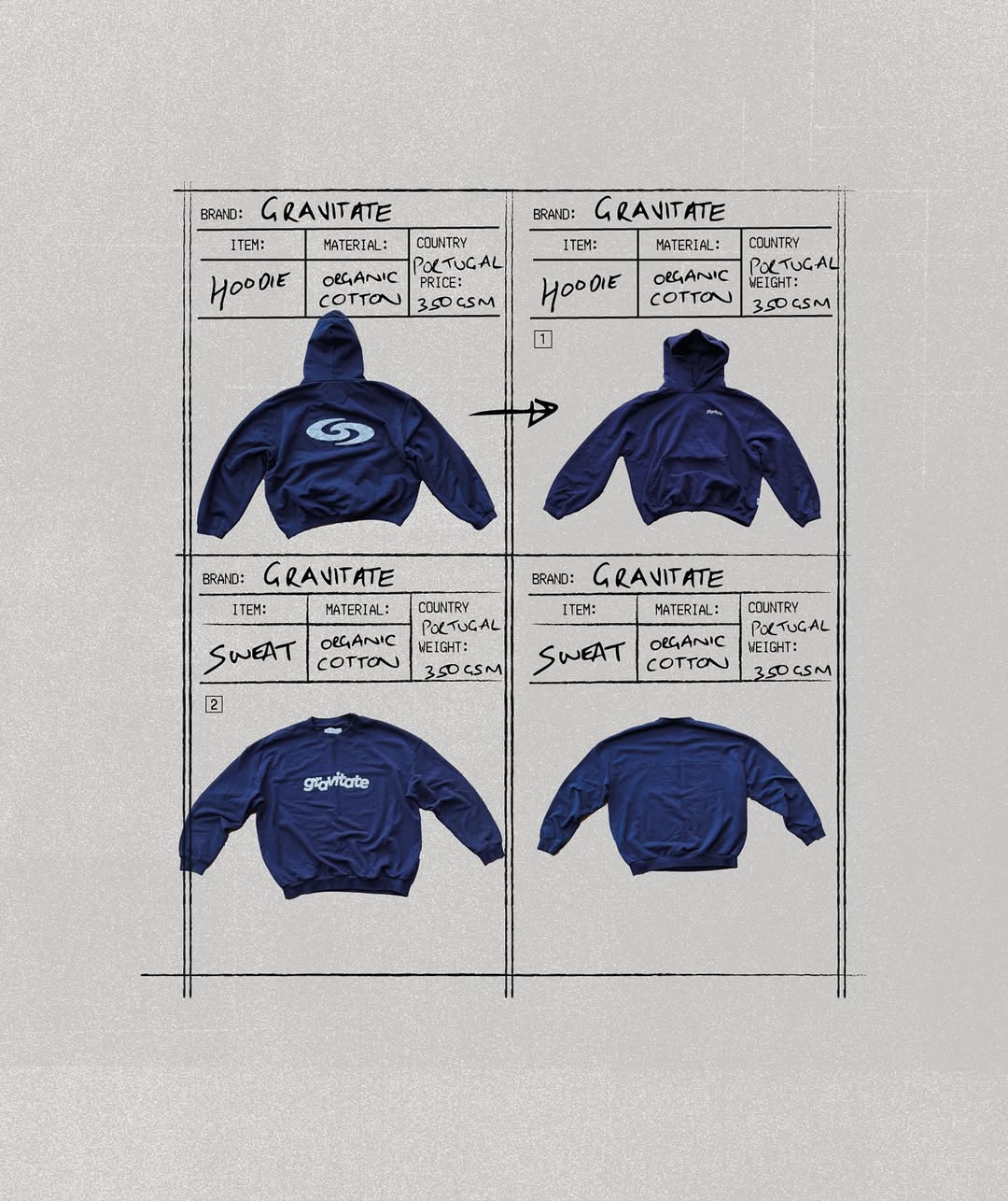
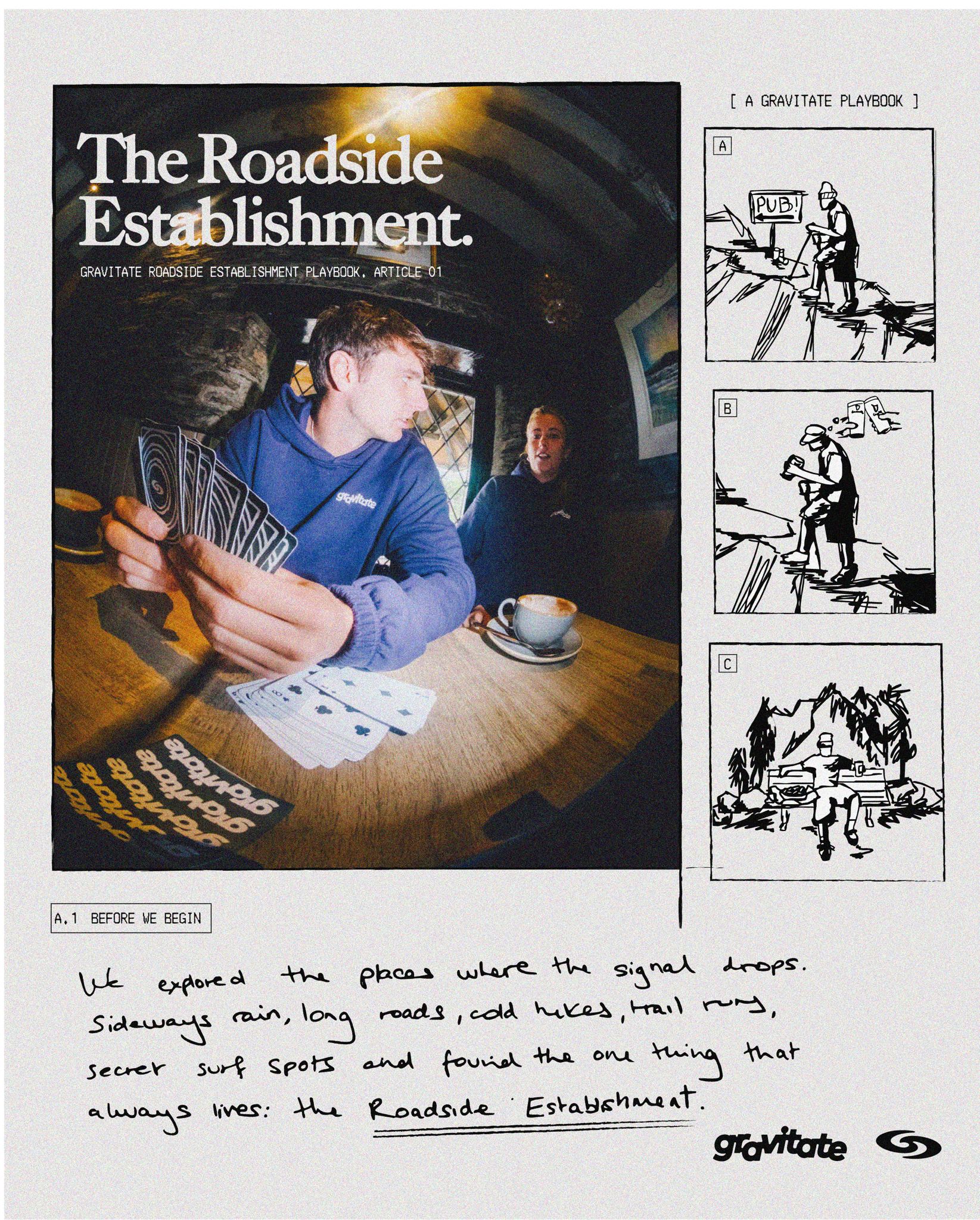
Once we had given Gravitate the design push that they needed, their team did an incredible job of keeping up with the social medias, with great photography, a good eye for composition, and a faultless way of displaying information, they had that load on lock! and occasionally they would come to us for some of the heavier work such as illustrations here and there, or general advice for direction!

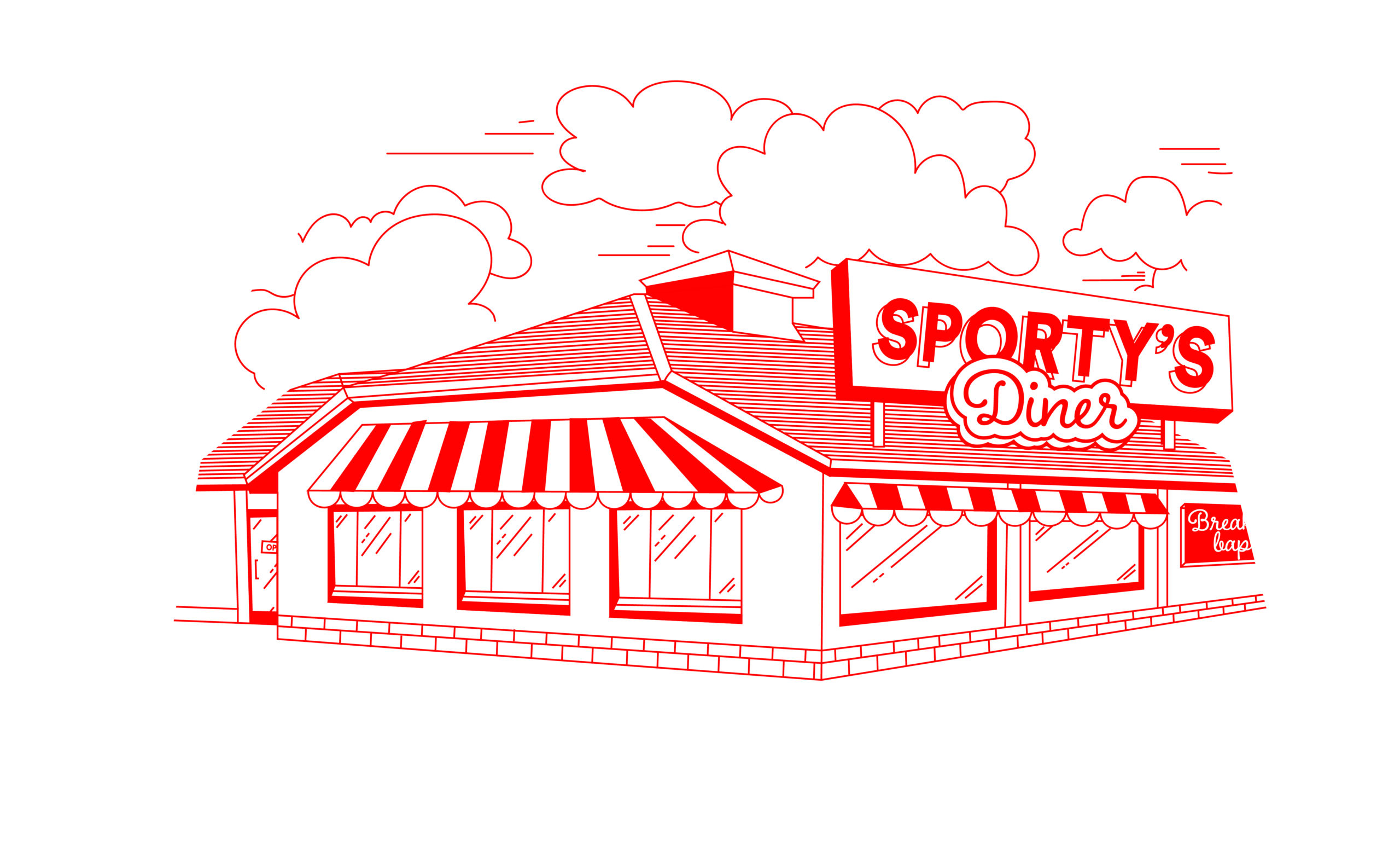
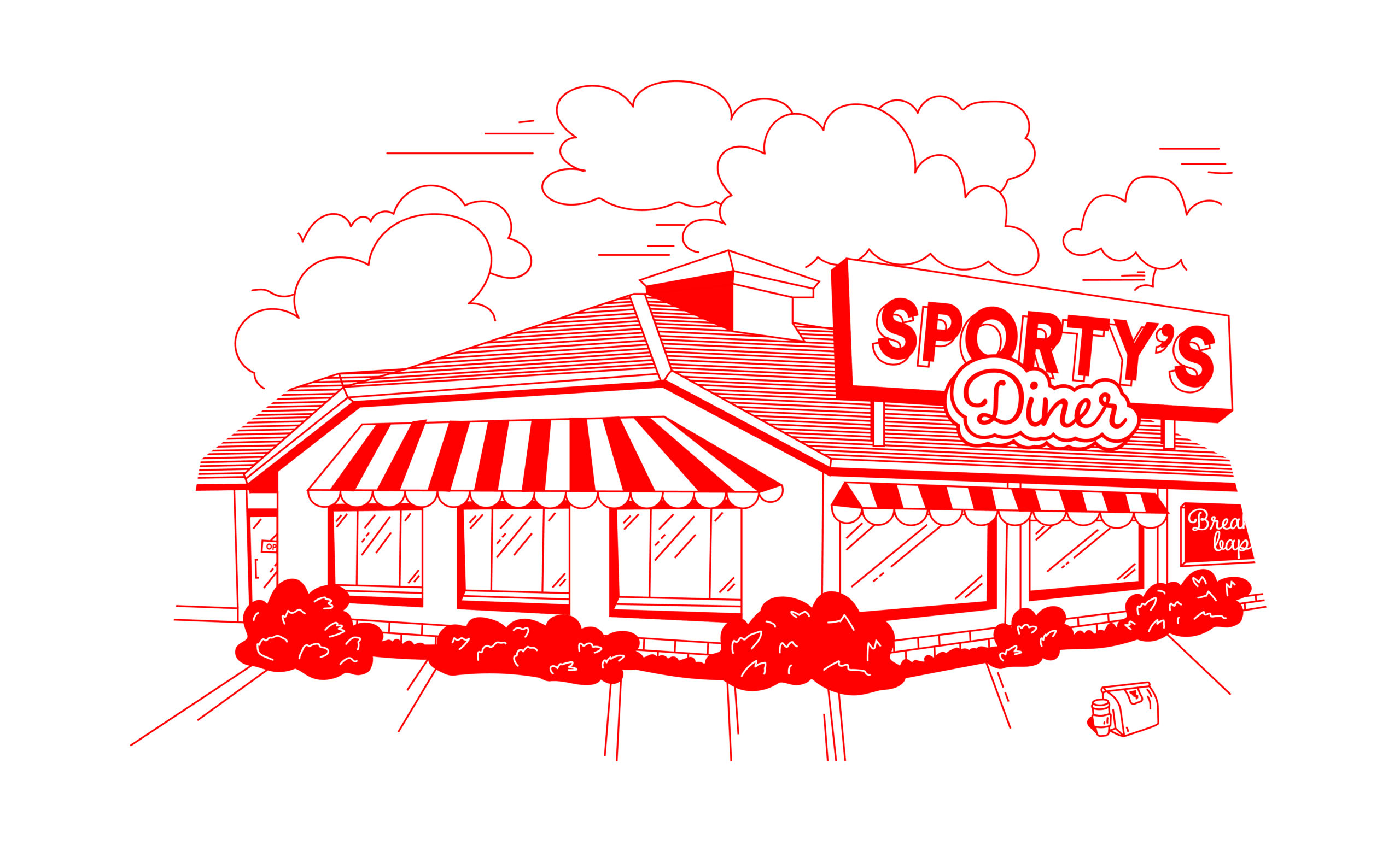
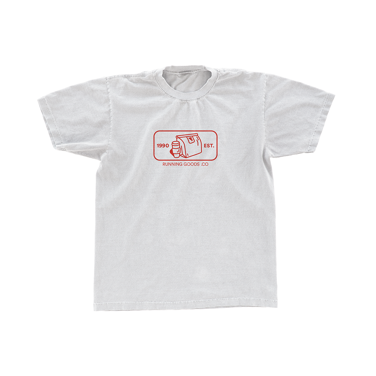
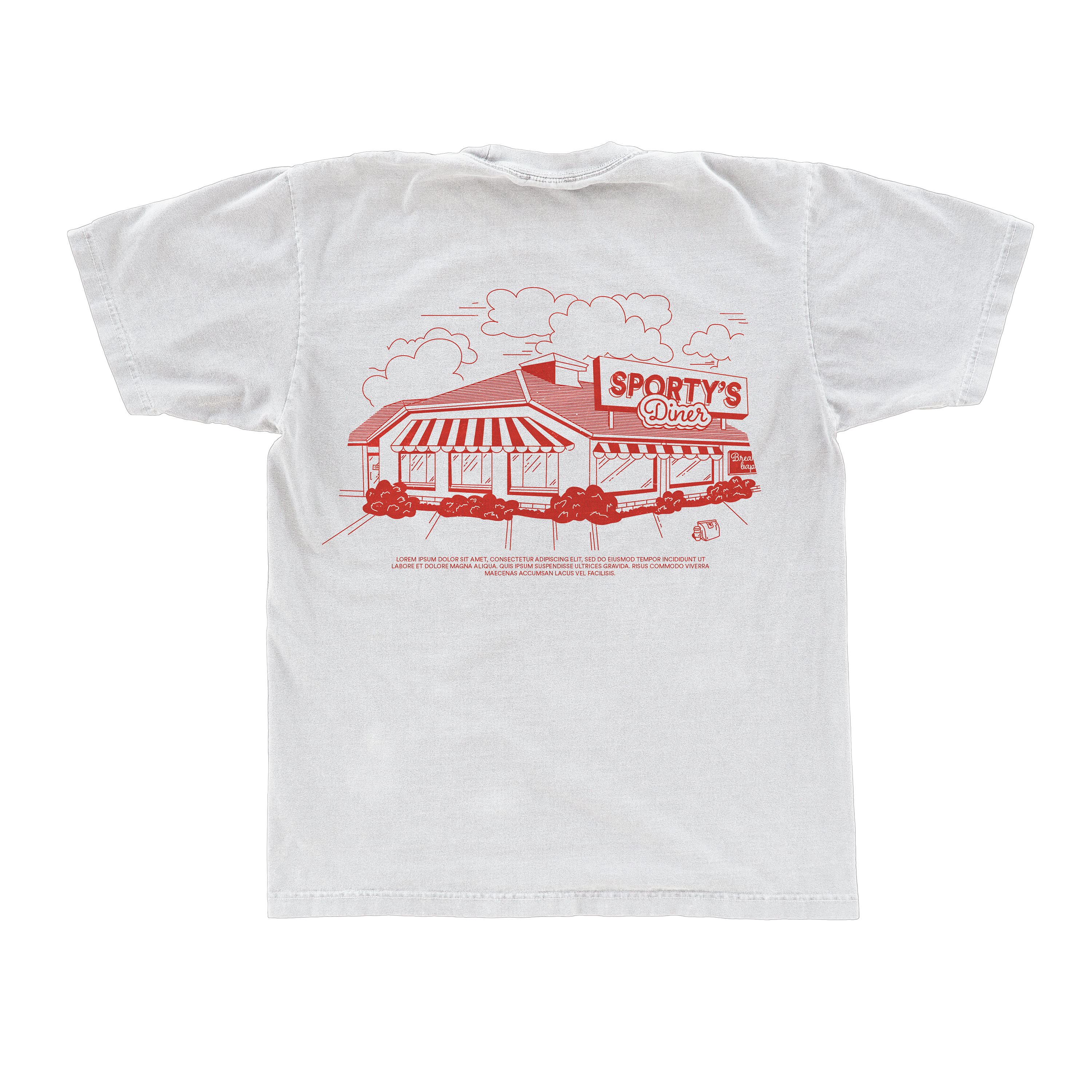
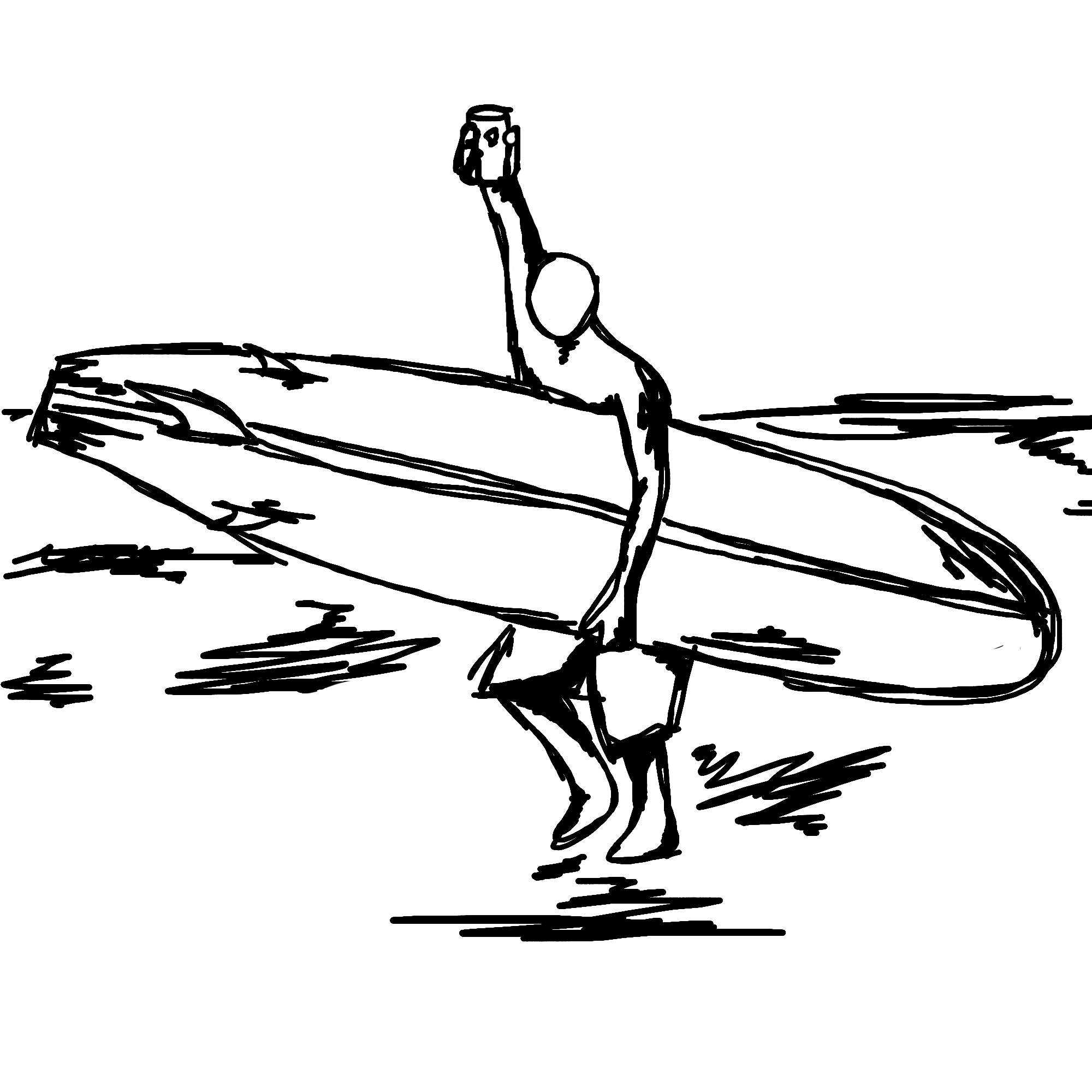
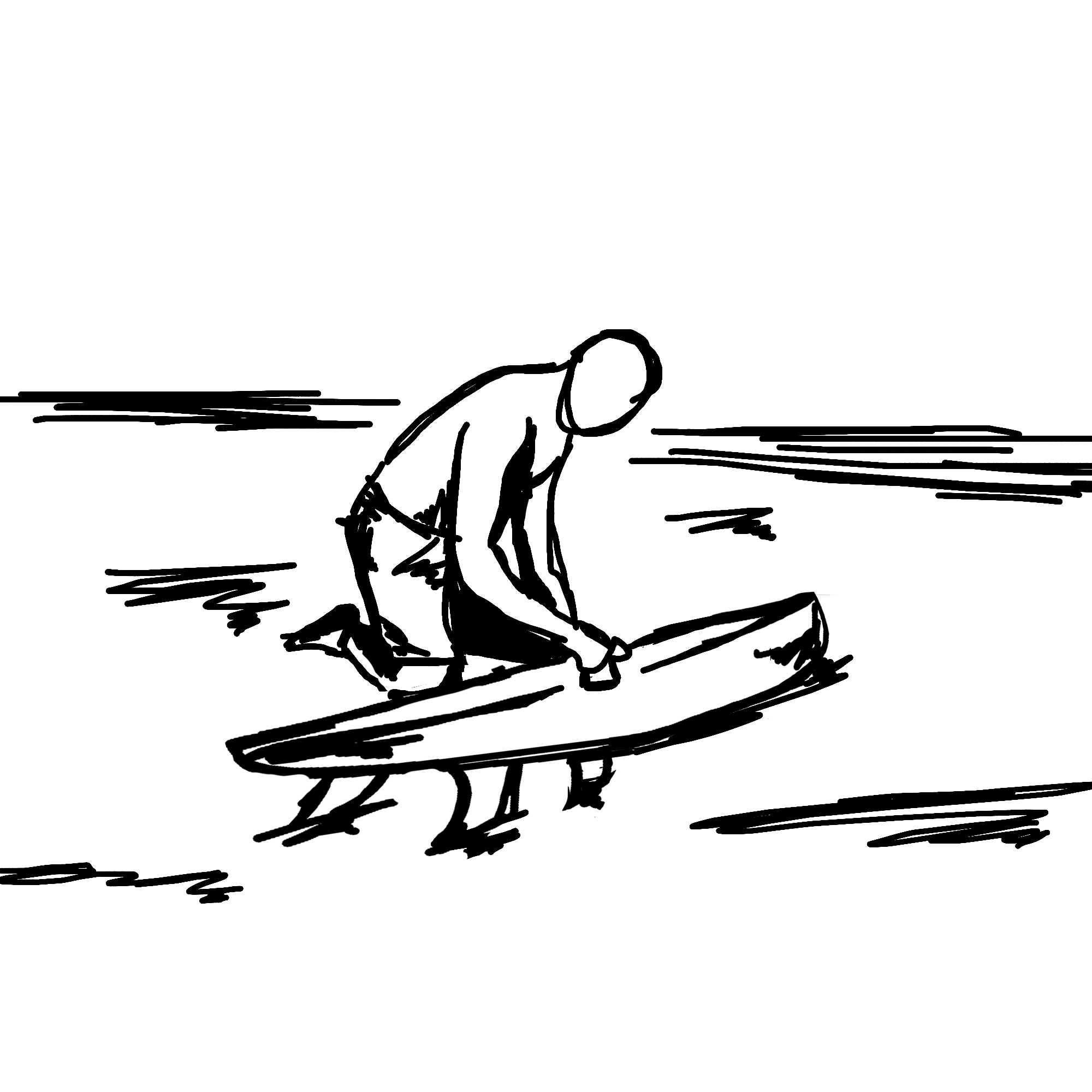
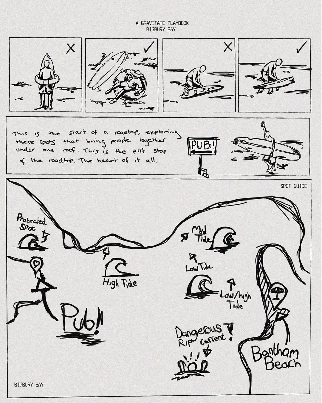
They had already smashed a drop previously, but this time around they had a vision, and the vision was centred around illustrations aswell as their core, which was photography… so they came to us of course 😉

so what did they ask for?

For this drop, it was all about the “road-side establishment” and out-door actvity, a super cool idea that was going to be displayed and stapled by this “road-side establishment”

The first idea was to have them find the location they wished to use, and illustrate that, to be placed on a variety of medias leading up to the drop, with it in mind, that things in the illustration could then be individually used as seperate elements for other things.

Moodboard

FIRST DRAFT

They had first decided that they where going to use a roadside Diner that would have been located at the end or a lenghty Hike thorugh a lovely place in Devon called “Holdon Forest” and this Holdon forest Diner, is a well known establishment in the area, and has been around for years, if people haven’t been in there, they have for sure driven past it, due to it being located on the side of a very main A30 road.

As you can see from the inspiration, everything has this “retro” vibe to it, as this is exactly what they wanted, however, we didnt just want to make it retro through the illustration style, attention to detail is important for this drop, as the whole reason for this “roadside establishment” movement, was because these establishments always have such a great, british, story behind them, and behind this diner, there indeed was.

It wasn’t always Holdon Forest Diner, it was once a “little chef” which was a very popular, british staple resturaunt chain that sadly went bust, so in memory of that, the base building for the illustration, was inspired by the old building of the little chef that was once there, giving the illustration a real ‘throwback’ feel to it.

pause ||

Gravitate where extremely pleased with the outcome, and didn’t have any tweaks for it… but this wasn’t the end of this project. Last minute, they had as a team, decided that they wanted this drop to be based around the “road-side” Establishment, but wanted to have that establishment on the sea-side, so the whole social could be linked to a big surf meet-up, as well as a hike… something Gravitate is centered around. So this was put in the Gravitate Archive, and we got back to work, with a 7 day timeline!

resume...

Gravitate still loved this idea of ‘retro’ but this time from punchy illustrations to… a retro camping guide? It sounded crazy at first, but once we started getting some ideas down… we knew this was going to hit.

Moodboard 2

final draft

Once the style was nailed down and the Gravitate team was happy, it was time to actually sort out the content. With it in mind that there was going to be a Hike, a pub, and a surf, I needed to create a journey that inked all 3, and illustrate that in a way that was clear, stylised, and different.

As you can see, with the illustrations there was a clear narrative… pints! mountains, hiking gear, snacks, good views, but centred around a good ol’ pint, these three illustrations are showing us some entertaining stages of what the hike would most likely look like, starting off with a pick me up (pint), running out, stopping for a snack (chips) and then pushing through to get to the end goal (Pub)

THE GUIDE

This here is an example of what these illustrations would look like when applied to this “guide”

As we can see, mixed with the grainy, dim-lit, fisheye photography, this style of illustration really sold the idea of this being vintage.

When all together, it looked great, and fit exactyl what they had envisioned.

time for the surfy bit

The hike was covered, now for the other end of the journey… the surfing!

They didn’t really have an idea on what they wanted this to look like, besides having it in the same style as the previous illustrations, and that they wanted some sort of ‘map’ / Diagram of the beach that the social was going to be at “Banthom” – so our plan was to have things that could be placed around this map… and what better than some surf, do’s and dont’s and just some funny surf related scenarios…

bringing it all together

With all of the illustrations done, it was time to apply all of these assets into social media material.Gavitate and the team did an incredible job of this, they took our illustraions, and our opinions for direction, then they took the reigns, and they killed it… check it all out.

FINAL OUTCOMES

want something similar?

Click this button and fill out a contact form, we look forward to hearing from you.

Info@auxa.co.uk

+44 7464 266837

Copyright © 2026 Auxa Creative LTD. All rights reserved. Registered in England and Wales

Info@auxa.co.uk | +44 7464 266837

Copyright © 2023 Auxa Creative LTD. All rights reserved. Registered in England and Wales