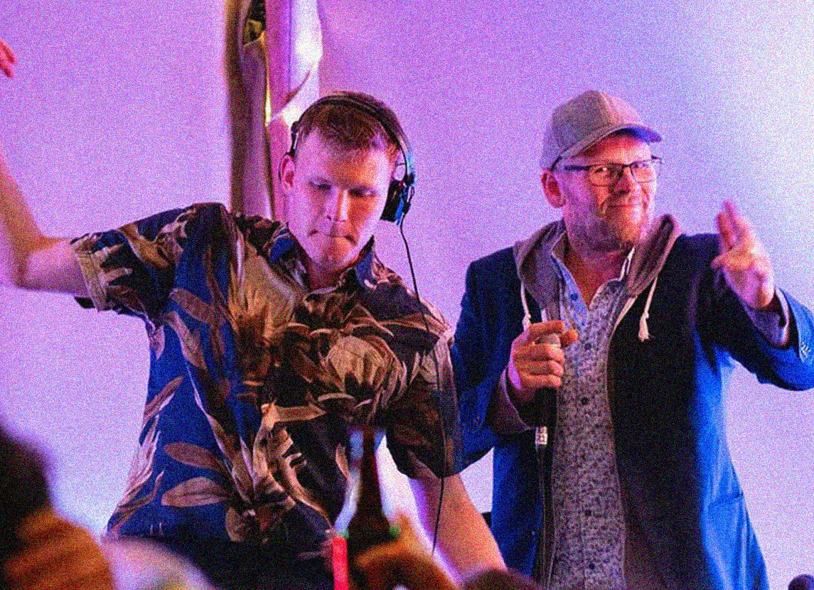
Daniel is a drum and bass producer/DJ based in Bristol. He came to us in need of some artwork for his tunes, he could create the audible art, but he needed our help, to create the visual… this is what we did for him.
ALONE
bouncing back ideas and looking for something fit, we discovered the name “NOA” Which is hebre for “movement, motion”. It was short, it looked great, sounded great… and most importantly it was different, it was standout, with meaning.
We created the wordmark first, making sure that we found the right typeface for the brand, we then tweaked and stylised it, and that really help set the tone for the icon… very directly as you can see. Using the crossbar for the ‘A’ we used this as a wave, as what better represents flow and movement other than water? but we couldn’t stop there, as NOA was all about control, stability, and movement, so we needed something to bring the icon closer to the ground… something solid like a rock.
With that an icon was created, not only did it look great, but it conveyed a simple diagram of what NOA was about without using any words… what more could you want from an icon? Pretty and fitting at first glance, and then upon discovery its rooted in meaning, bosh.
LEAVE
After bouncing back ideas and looking for something fit, we discovered the name “NOA” Which is hebre for “movement, motion”. It was short, it looked great, sounded great… and most importantly it was different, it was standout, with meaning.
We created the wordmark first, making sure that we found the right typeface for the brand, we then tweaked and stylised it, and that really help set the tone for the icon… very directly as you can see. Using the crossbar for the ‘A’ we used this as a wave, as what better represents flow and movement other than water? but we couldn’t stop there, as NOA was all about control, stability, and movement, so we needed something to bring the icon closer to the ground… something solid like a rock.
With that an icon was created, not only did it look great, but it conveyed a simple diagram of what NOA was about without using any words… what more could you want from an icon? Pretty and fitting at first glance, and then upon discovery its rooted in meaning, bosh.
want something similar?
Click this button and fill out a contact form, we look forward to hearing from you.