BARRINGTON CLARKE

BARRINGTON CLARKE

sleek and smart

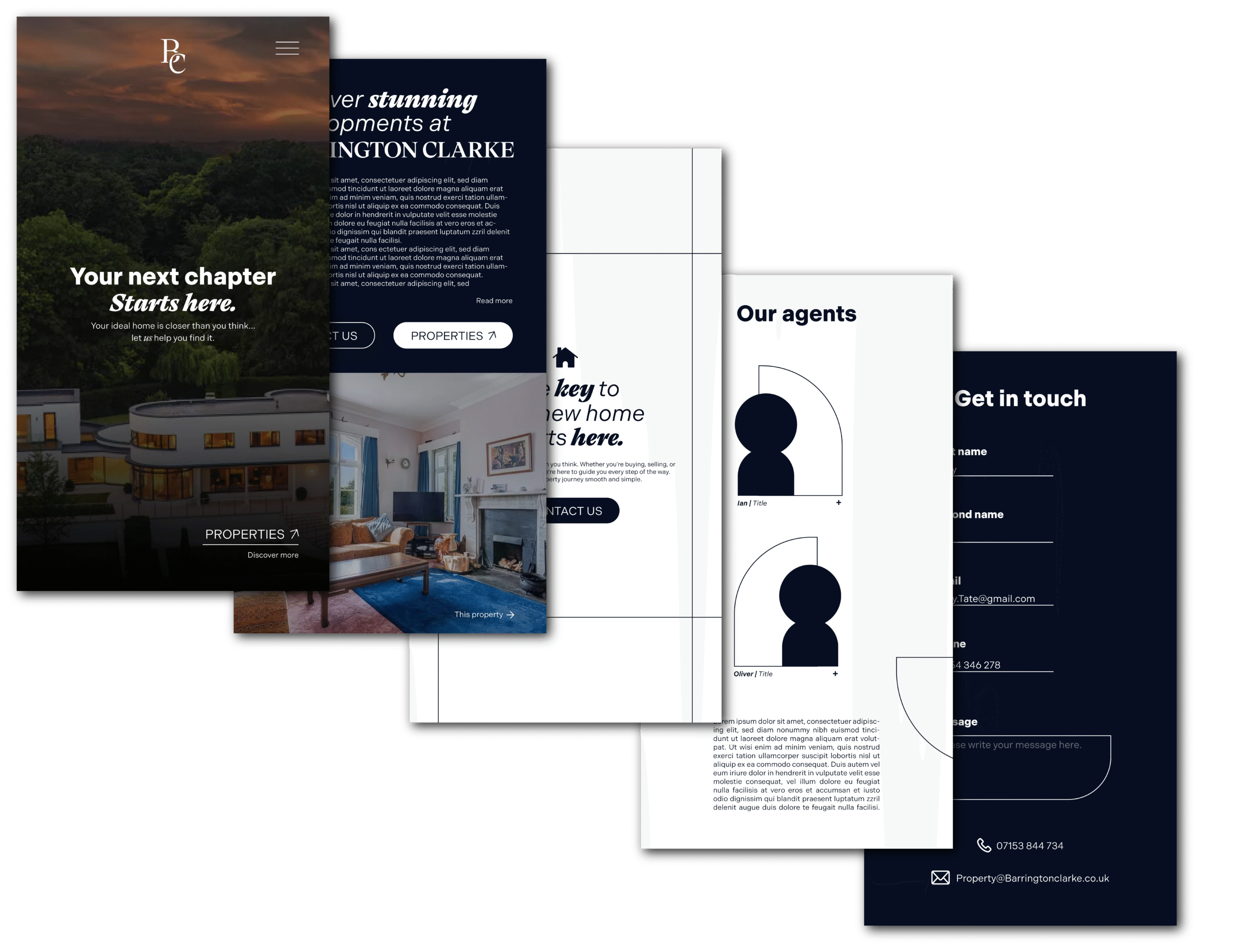
Oliver Clarke came to us in need of bringing his vision to life, With a large list of contaccts, and having worked within the industry for over a decade it was time that Oliver went his own way with real estate and opened up his own company… Of course he came to us.

He holds high value property, and his clients where of a certain “type”, so without knowing what it would look like, he just needed something that would please the eye of someone with a distinguished taste, and normality of living.

minimal & memorable

We knew we had to stay away from illustrations and sans serif fonts, not only because it was too overused in the space, wether that was just plain and boring, or too wispy and old, we wanted to go in a direction that was modern, sleek, but still held those high-er society values.

With playing around with serif font types, once the right one was found, the wordmark almost seamlessly created itself with some spiratic experimenting… Moving this bit here, this bit there, and removing that, leads to the outcome that we have now.

Despite the expeirmenting being implsive we made sure that there were boundaries, making sure that whatever logo mark we created, it sat perfectly within a square. This is done for a few reasons, not only is it the most aestehtically pleaseing approach, but it also leads it to being a perfecly compatible icon that can be but with, or placed anywhere, and it look like it belongs.

the selling point

Now the website for Barrington Clarke was something that needed to be functional, informative, and attractive, but… not too much of any of those. We we’re told that the people who would be buying these properties simply don’t have time, nor do they have patience to be sifting through an ugly website filled with information, so it gave us the task of creating something that actually looked great, was super simple and straight to the point (looking at the listings) whilst also delivering enough valuable key information to build reliablity and trust… all of this needed to happen within the first few moments of someone landing onto the page… so we got to work.

lANDING PAGE

SEARCH PAGE

SELECTED PROPERTY PAGE

MOBILE VIEW

This was a very detailed mock-up, something that we don’t usually do, we usually take it straight to the web and make it all there, and amend as we go, but they needed this flat for an investor presentation… and it worked a treat, all of this put into a PDF that was easily controllable, and didn’t need wifi to navigate,really hit the spot for what they where wanting.

want something similar?

Click this button and fill out a contact form, we look forward to hearing from you.

Info@auxa.co.uk

+44 7464 266837

Copyright © 2026 Auxa Creative LTD. All rights reserved. Registered in England and Wales

Info@auxa.co.uk | +44 7464 266837

Copyright © 2023 Auxa Creative LTD. All rights reserved. Registered in England and Wales