DIE TWICE

DIE TWICE

Baseline brand assets

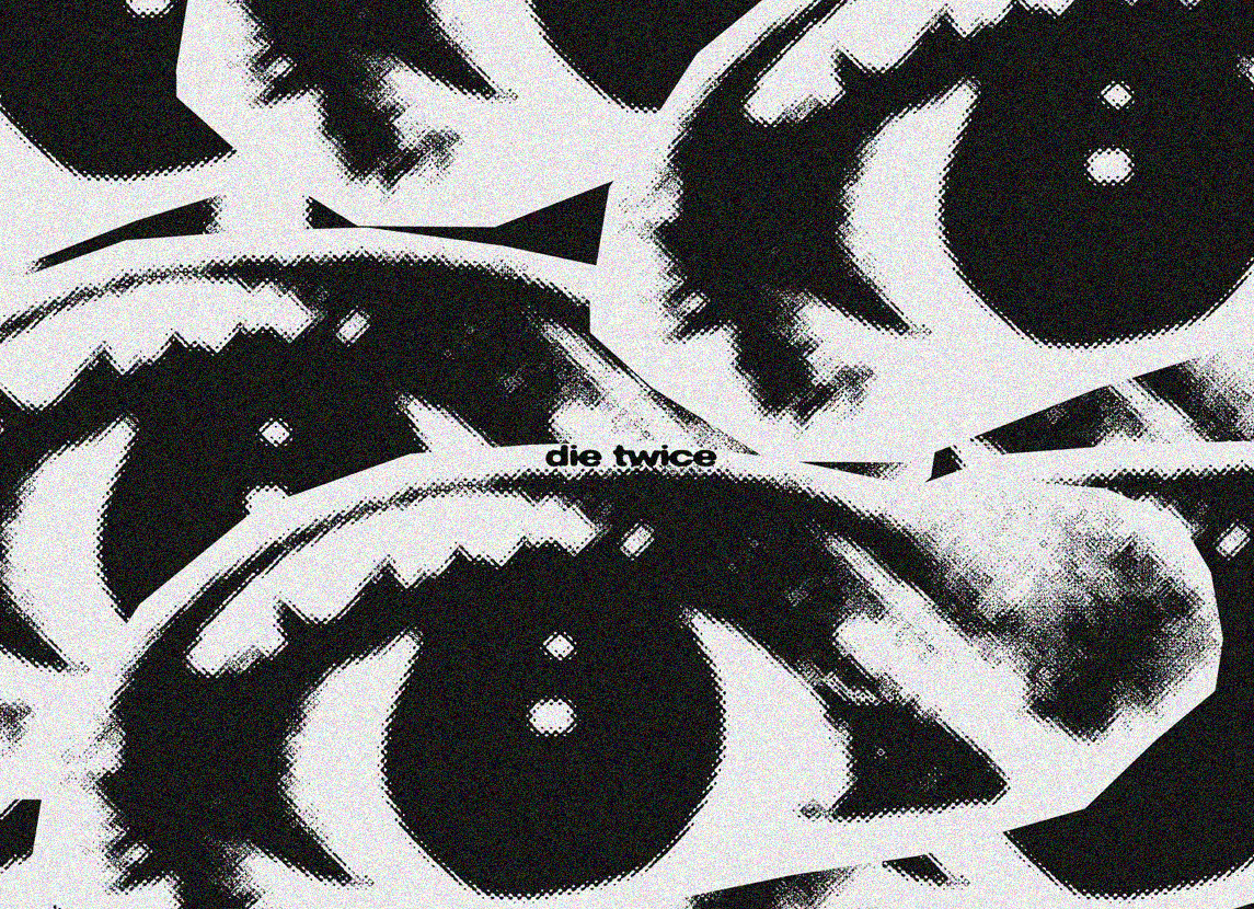
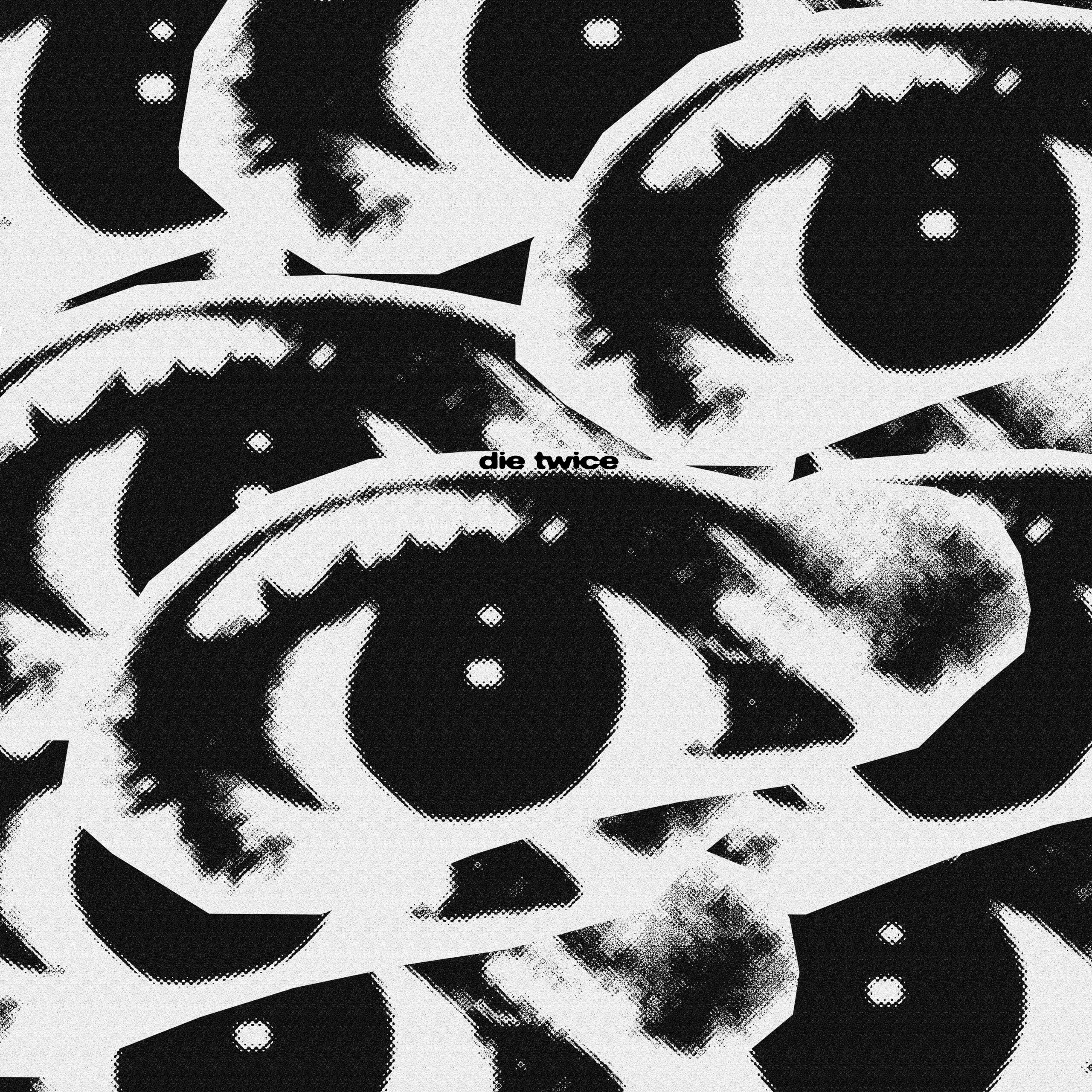
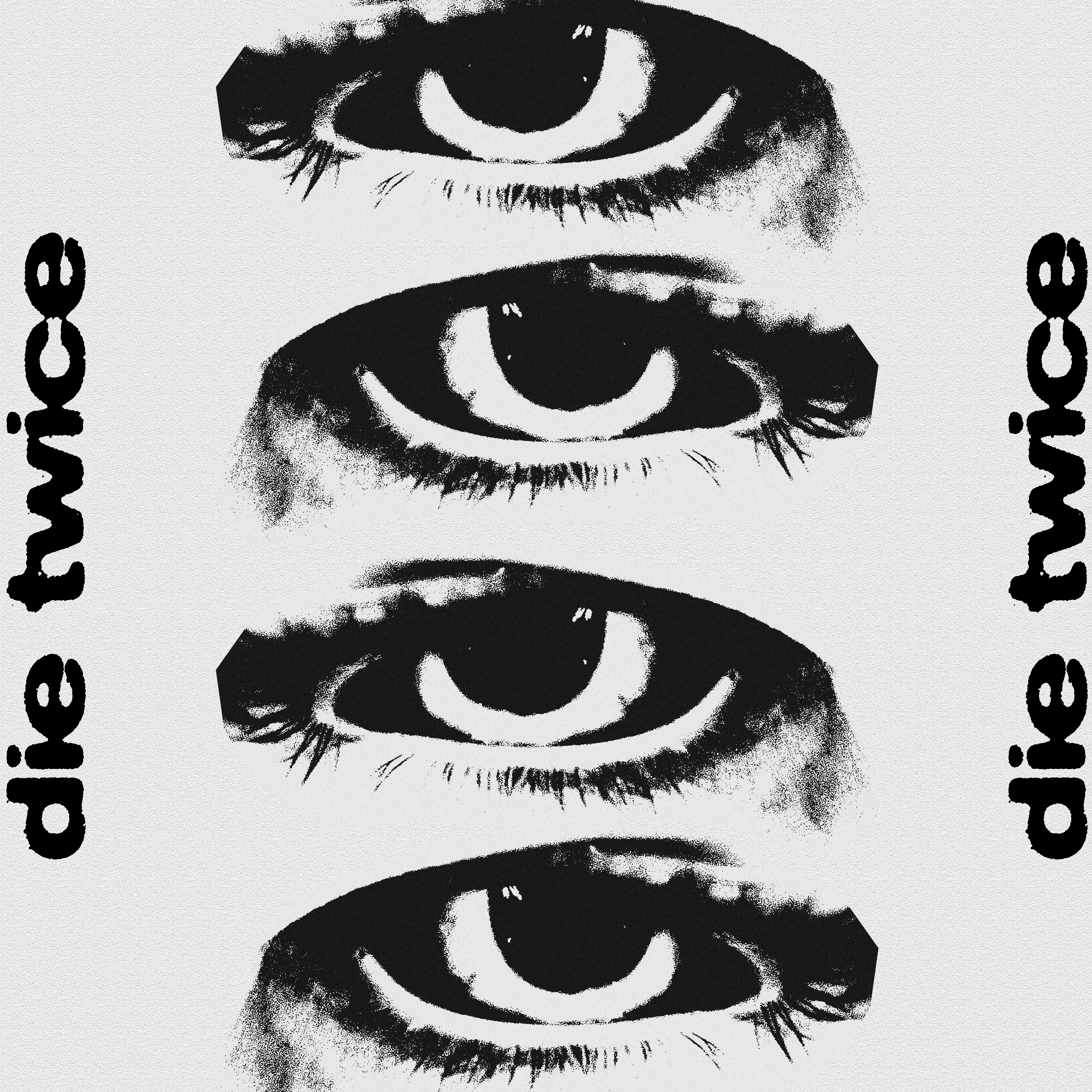
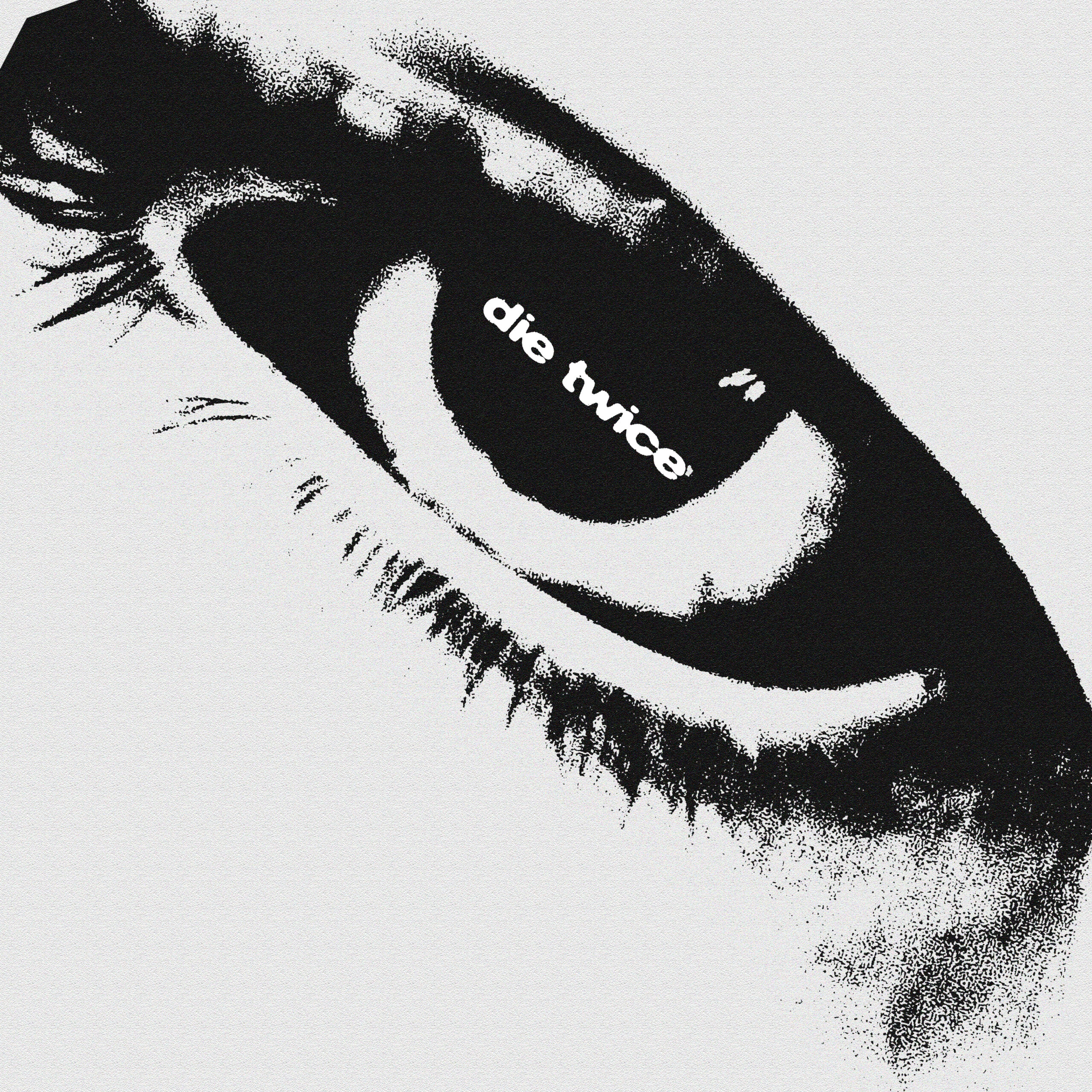
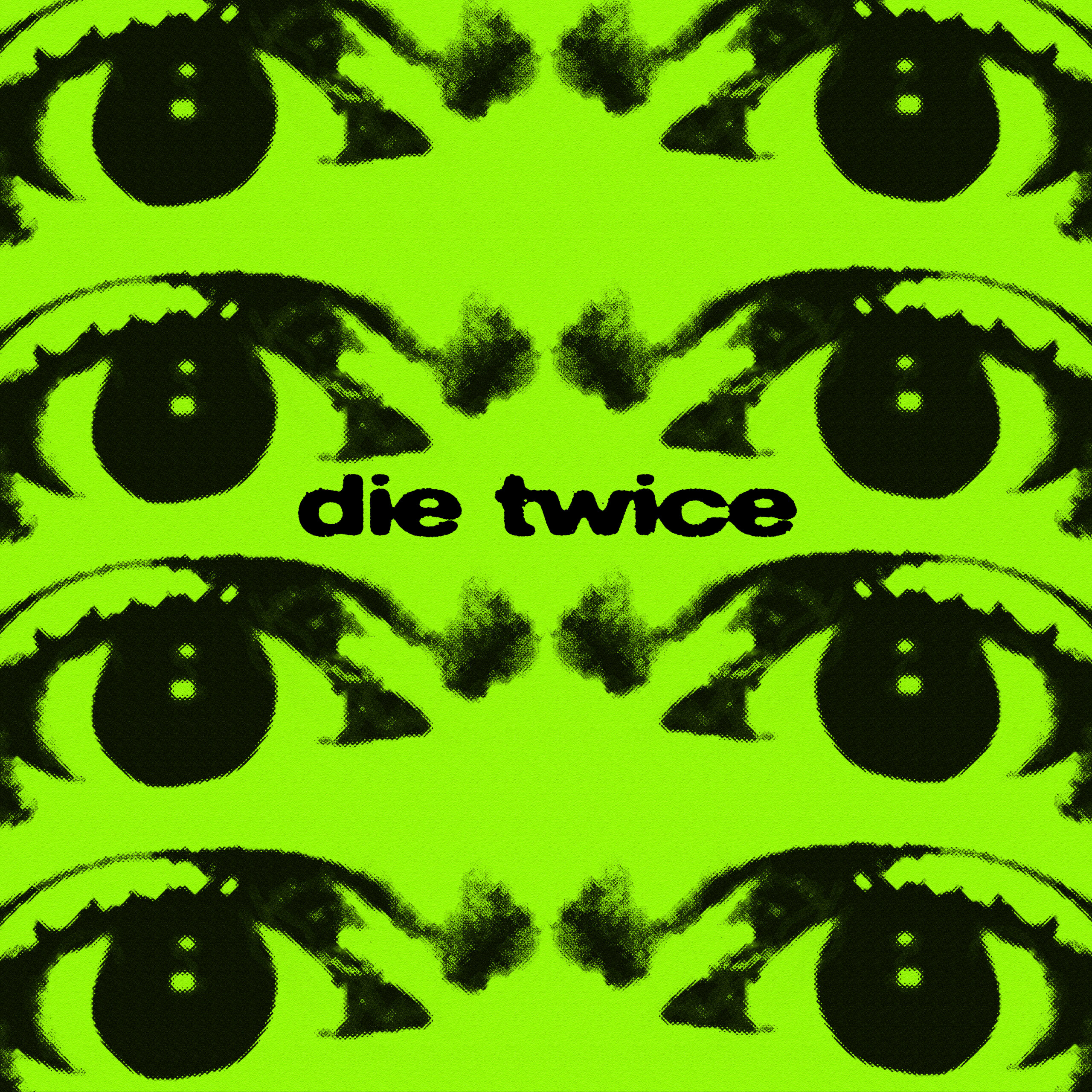
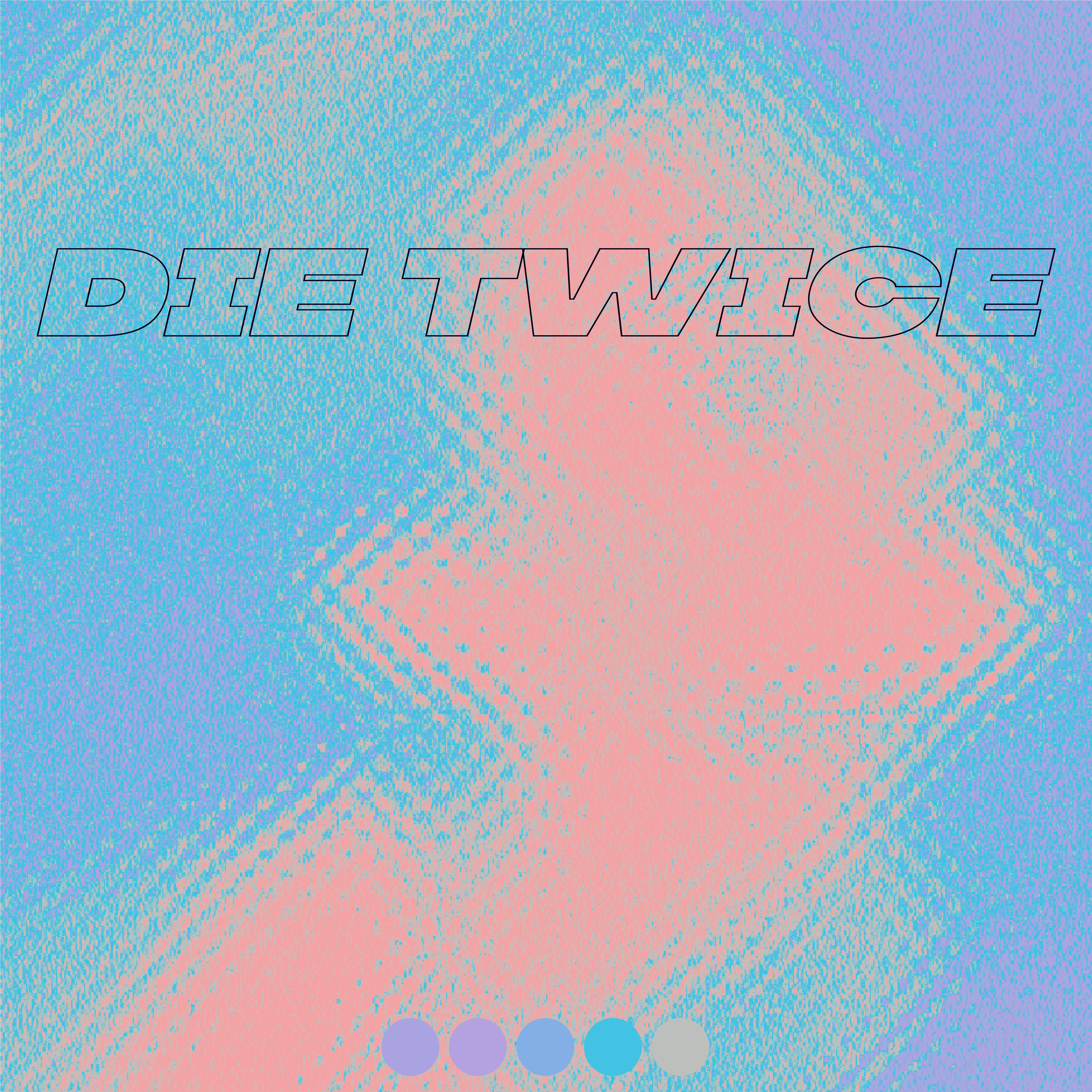
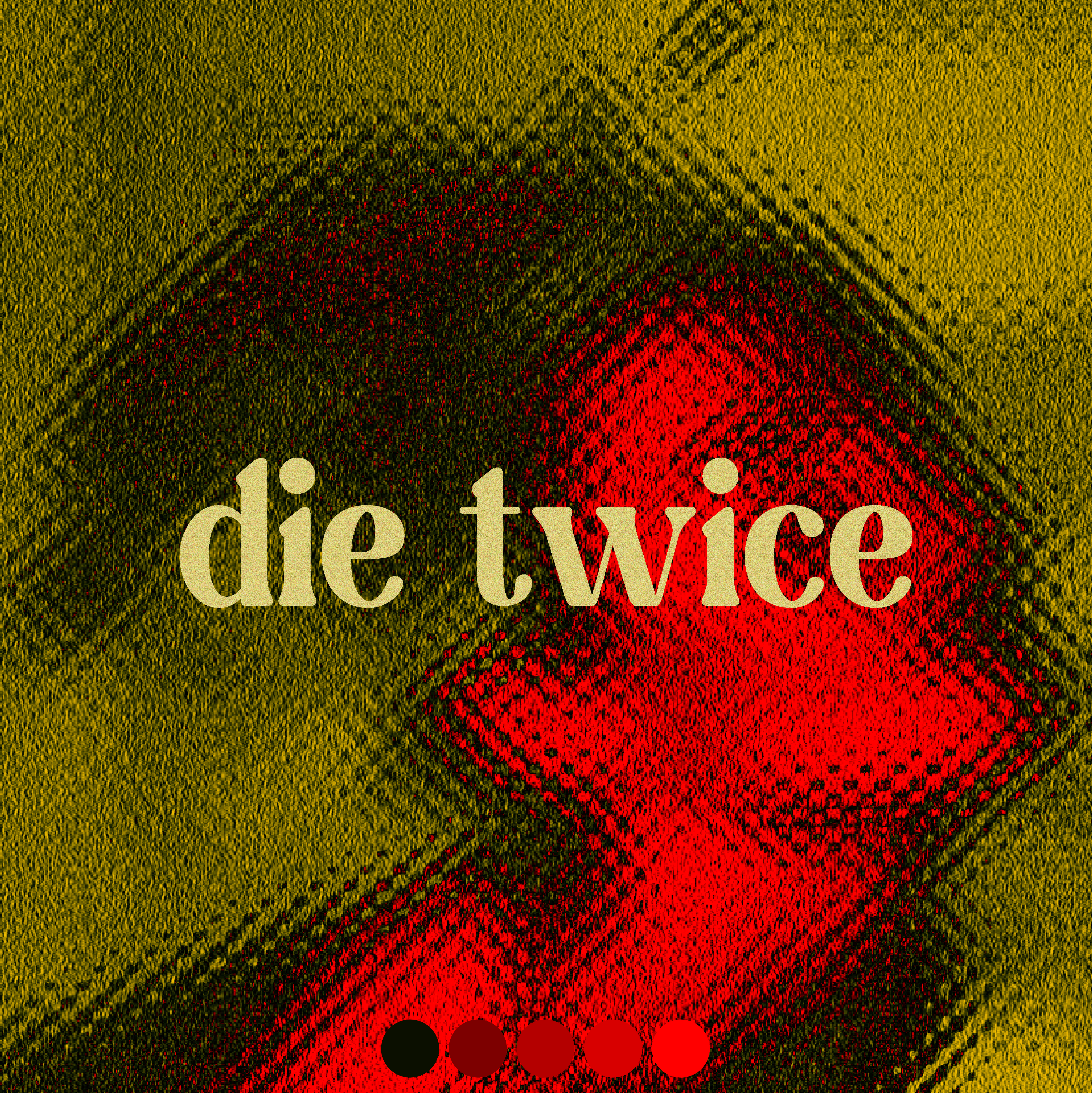
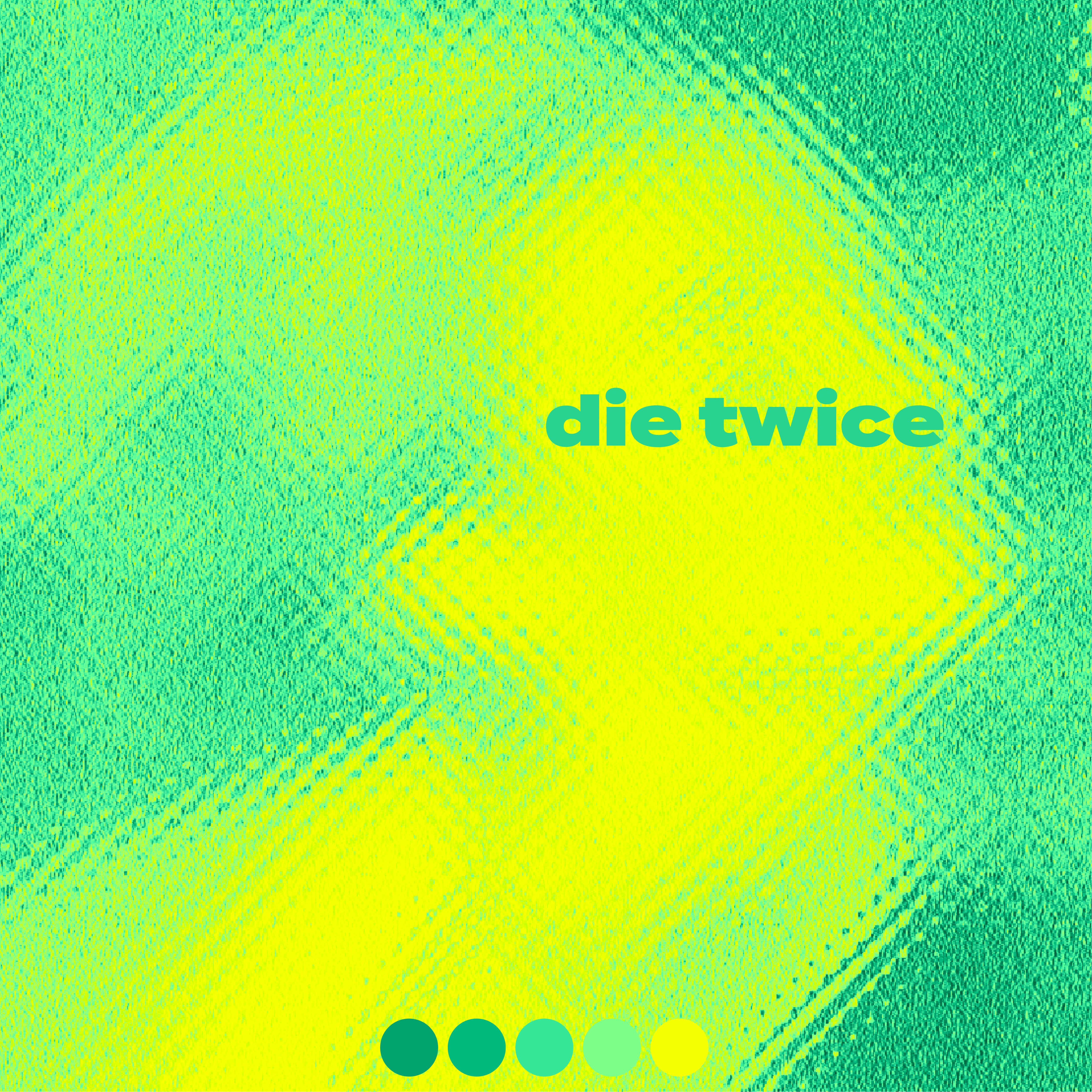
We worked with Die Twice back in 2020 when they we’re still very much so just a small college band yet to have any gigs that we’re larger than a 15 person crowd in a pub.

They Gave Jack a call as they needed some assets that they could throw around and re-purpose for posters, social posts, and anyhting else Die Twice related. With complete creative freedom Jack got to work!

The vibe

As you can see, Die Twice liked the idea of an eye, so we went with that, and did what we could. We used photographs of real eyes and played around with colour, texture, and depth. The eye was already a great tool for conveying emotion but we really wanted to push the grungey vibe of Die Twice some more.

Grain, bleed, and saturated colours is the direction we went in, and they loved how it turned out.

other assets

With the next set of assets we trialed out more texture, colour, and fonts. This was a short timed project, so we just got visuals out, more ideation than final peices, but it gave the early days of Die Twice a good visual foundation to build off of.

a beautiful thing

With their takeoff and us being backed up, they leant towards designing their own things and having an arrays of friends design their things… But with that being said, with their latest released EP “A Beautiful Thing” they went back to their roots and re-used the eye asset from the start as the main album art… talk about a timeless design eh 😉

want something similar?

Click this button and fill out a contact form, we look forward to hearing from you.

Info@auxa.co.uk

+44 7464 266837

Copyright © 2026 Auxa Creative LTD. All rights reserved. Registered in England and Wales

Info@auxa.co.uk | +44 7464 266837

Copyright © 2023 Auxa Creative LTD. All rights reserved. Registered in England and Wales